In short
Problem
14 screens of registration and onboarding before users could see a single activity, without ever explaining what Baesh is.
What I did
A step-by-step walkthrough as a new user, a behavioral map of what people do, think and feel, and a redesigned flow with a rationale for every screen.
Recommendation
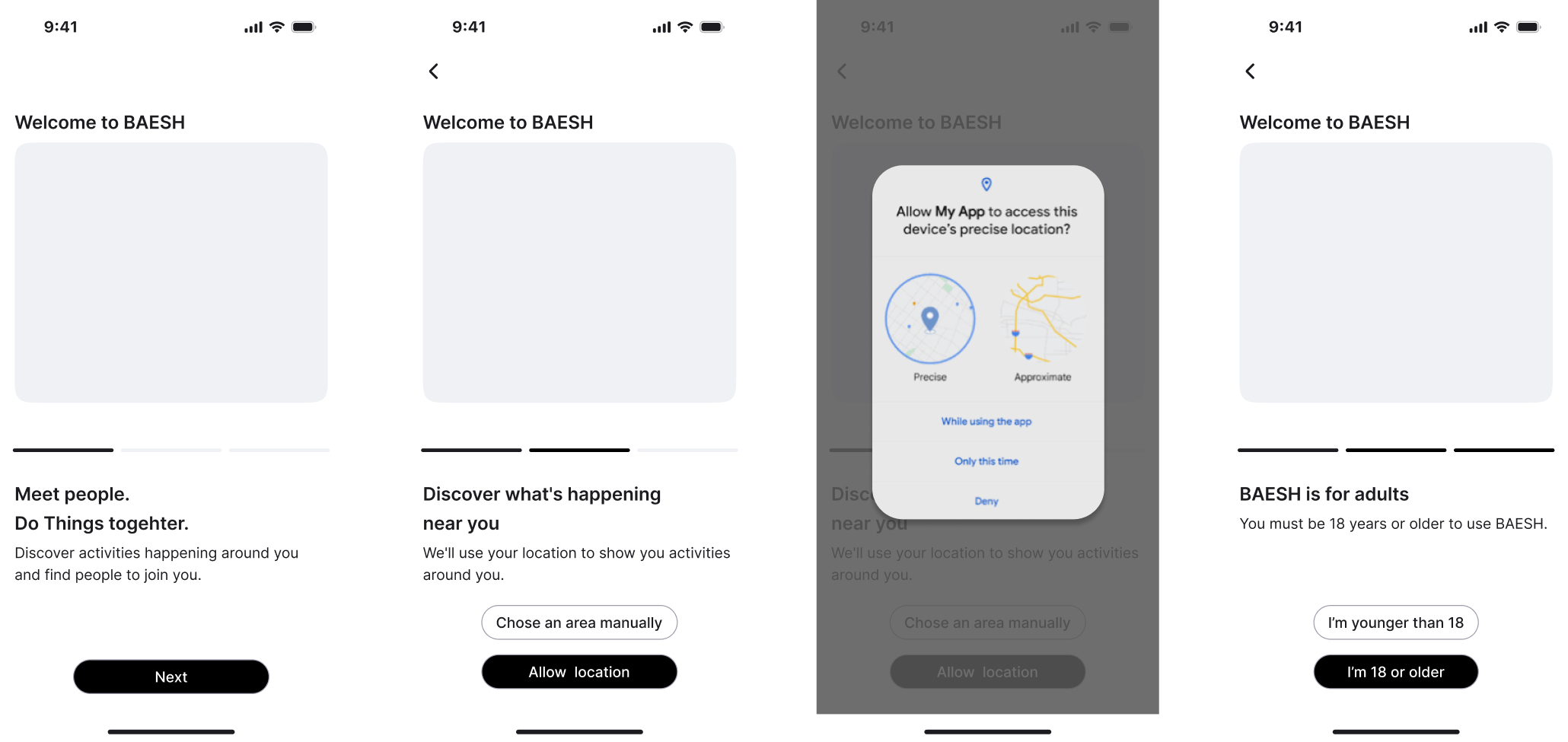
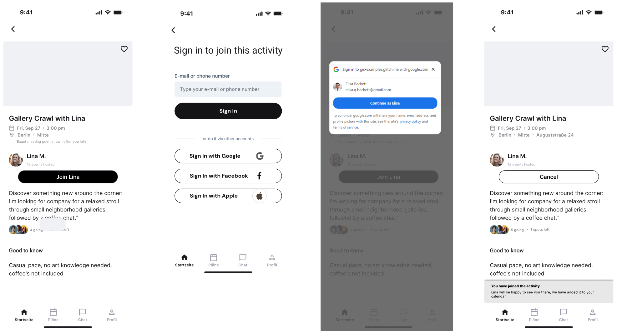
Show the value first: a 3-screen wizard, then the feed. Ask for an account only when someone wants to join an activity.
My role in this project
What I owned
- Expert analysis of the existing product (cognitive walkthrough)
- Behavioral map of the sign-up flow
- Recommendations and the proposed wireflow
Must stay in the flow
- Privacy and consent
- Age confirmation (18+)
- Registration moved to the moment users join an activity
Not yet validated
- Implementation and business decisions are up to the Baesh team
- Usability testing with new users is still pending
01 · Walkthrough
14 steps through the sign-up as a brand-new user.
I went through every screen as a brand-new user and noted each moment of doubt, confusion or frustration.
14 screens before a new user sees a single activity. Friction grows with every phase.
01 · Start & email
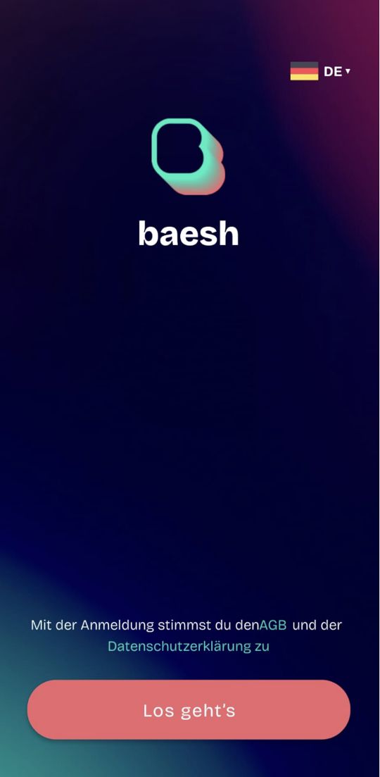
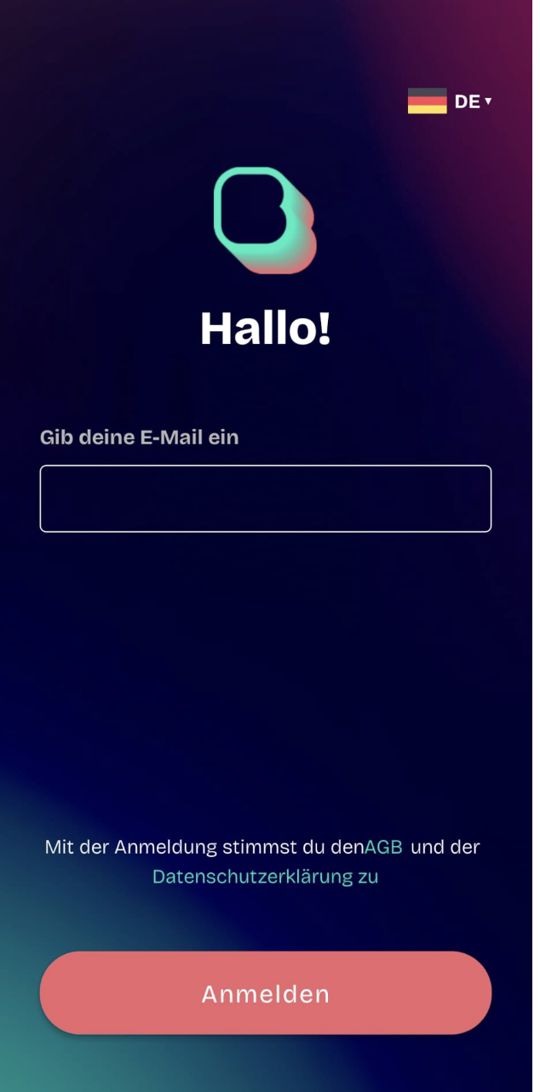
No idea what the app does.
02 · Verification
Errors that don't explain.
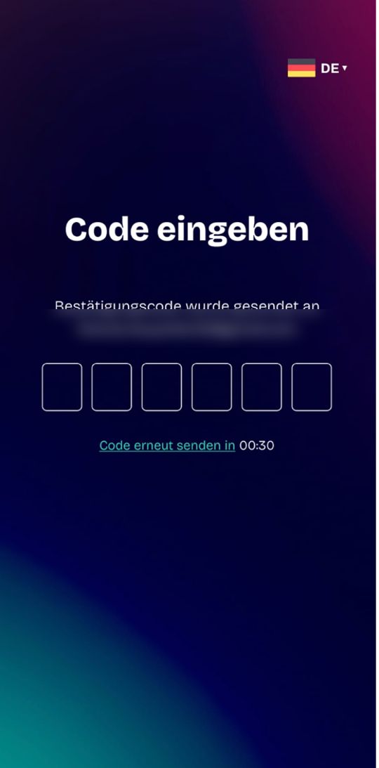
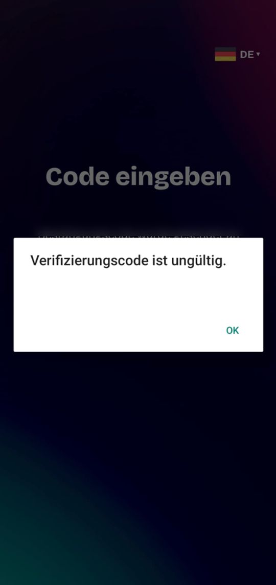
03 · Profile
Personal data before any value.
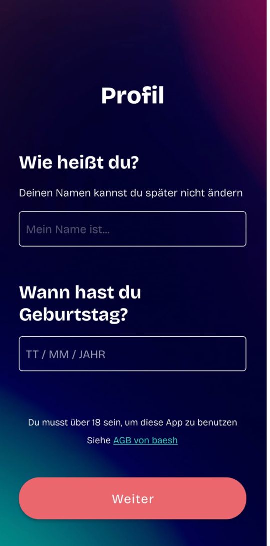
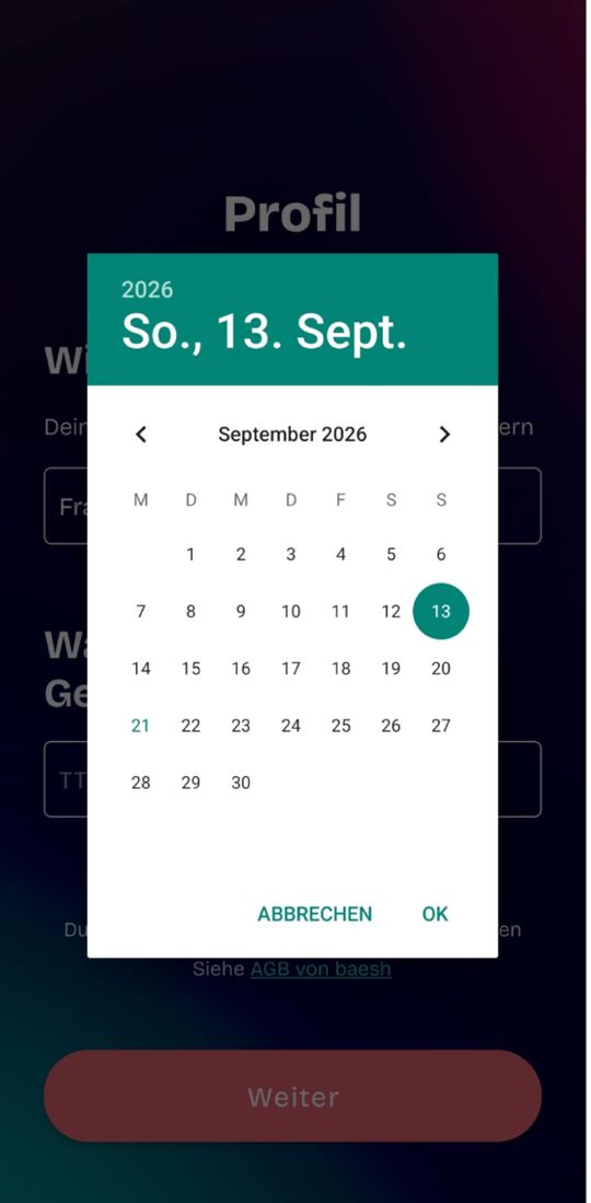
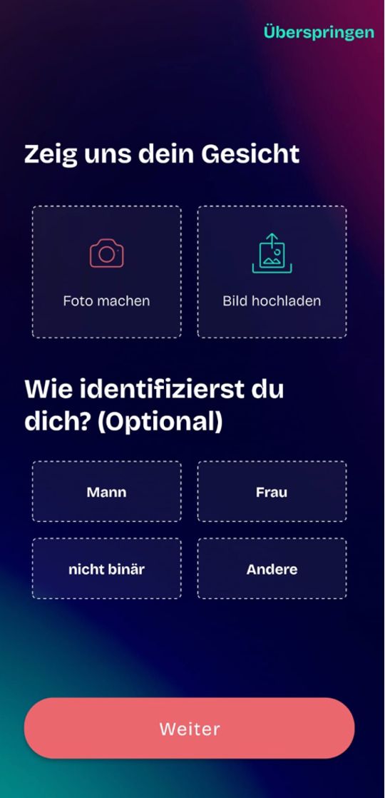
04 · Onboarding
Still unclear after 8 steps.
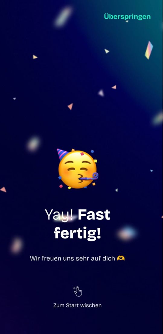
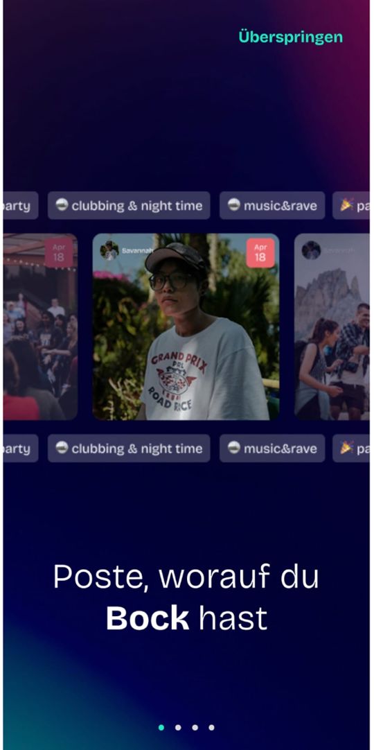
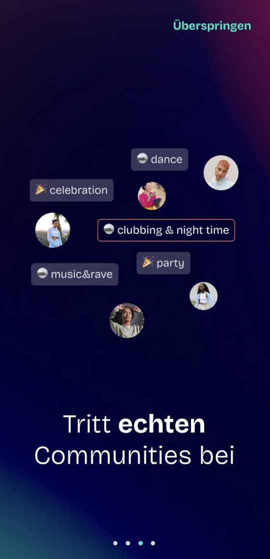
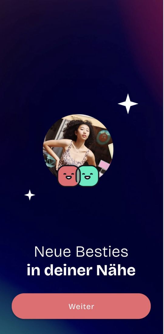
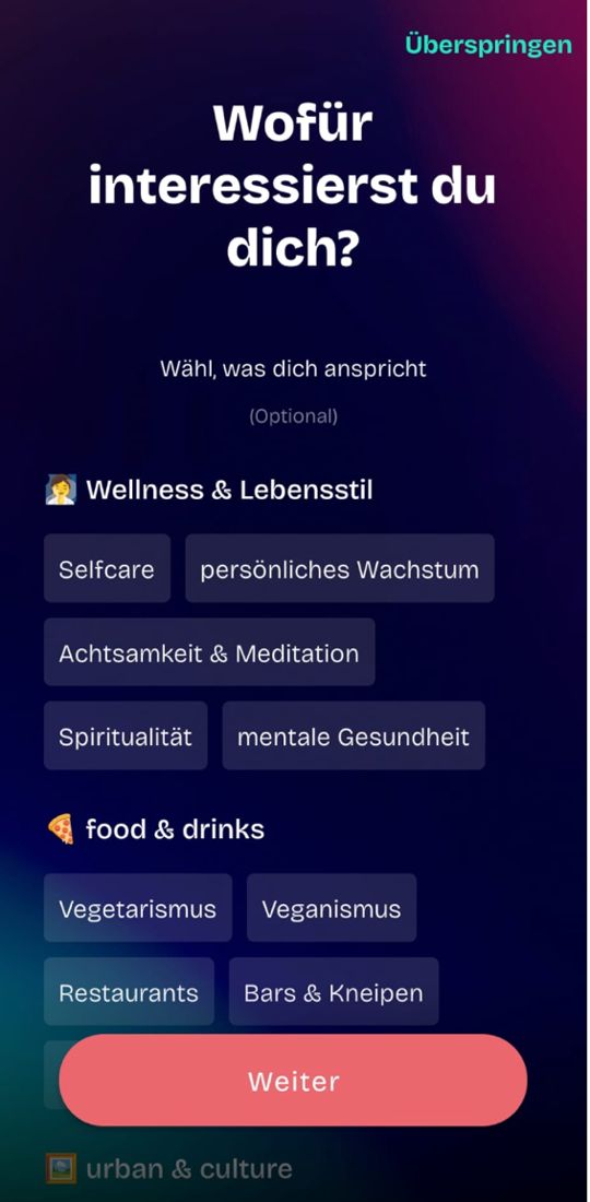
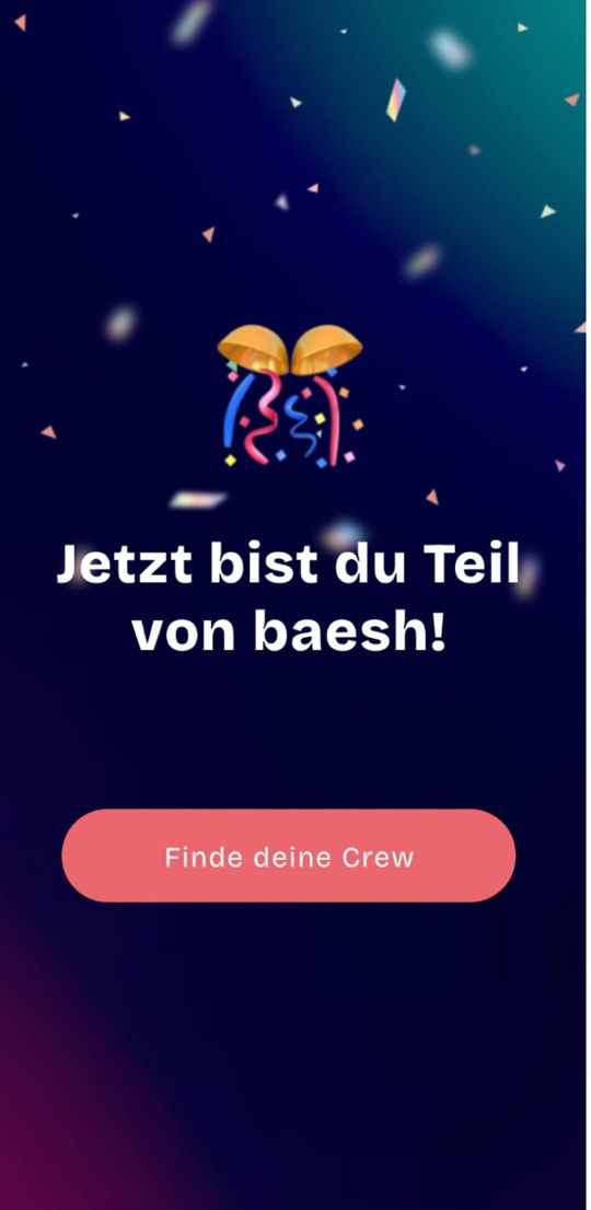
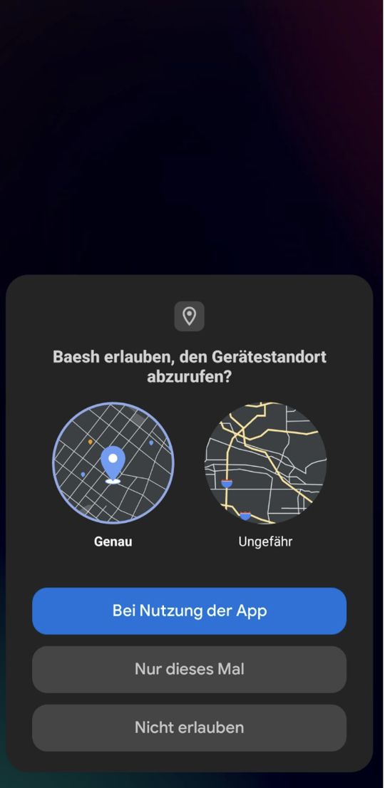
05 · Permissions
Asked for without a reason.

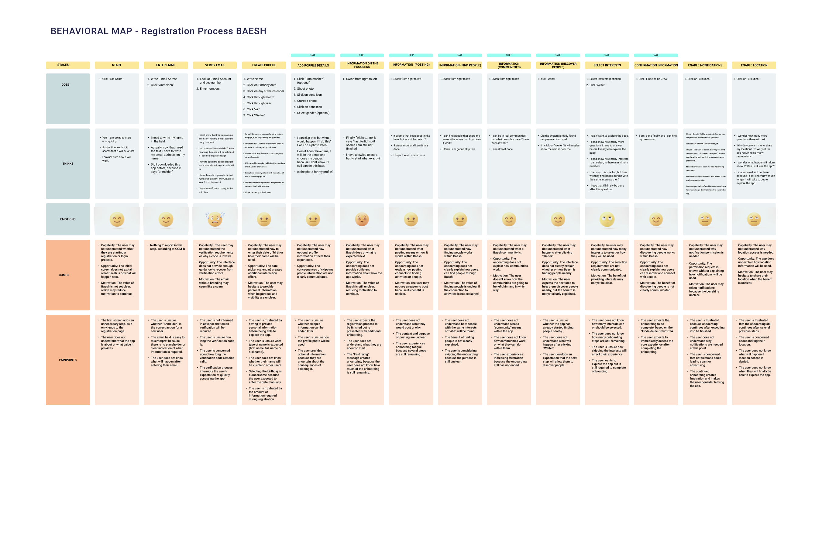
02 · Behavioral map
What users do, think and feel at every step.
I mapped the 14 stages of the original flow. The “thinks” row tells the story better than any metric:
“Just with one click, it seems that it will be fast.”
“I want to explore the page, but it keeps asking me questions.”
“I have to swipe to start, but to start what exactly?”
“Why do I have to accept messages? I don’t even know yet if I like the app.”
“Maybe I should just close this app. It feels like an endless questionnaire.”
03 · Diagnosis
Three root causes.
1
Too long
14 screens of registration and onboarding before users reach the feed.
2
No value shown
The flow never explains what Baesh actually does.
3
No “why”
Name, birthday, notifications and location are requested without a reason, which creates distrust.