← All projects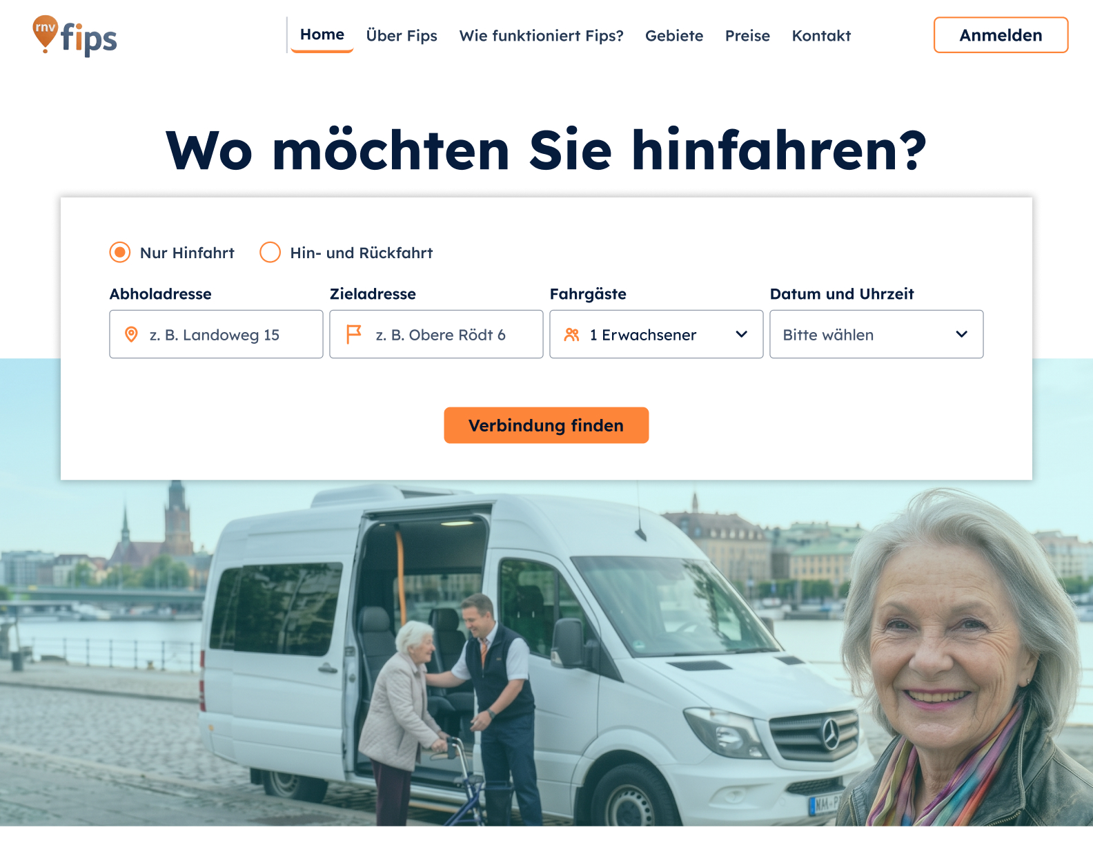
Case study · Web App · Behavioral Design
Fips Mobility
Redesigning an on-demand bus service from Germany: from a complex app to an effortless, accessible web platform for seniors.
Case study · Web App · Behavioral Design
Redesigning an on-demand bus service from Germany: from a complex app to an effortless, accessible web platform for seniors.
In short
Problem
Existing usage data showed it: 8 out of 10 seniors stopped using the on-demand bus after their first trip.
What I did
10 interviews, COM-B diagnosis, choice architecture and a new web booking flow designed for seniors on a computer.
Outcome
Root cause found (time pressure + no trigger at home), two high-impact interventions with measurable KPIs and a hi-fi web booking flow designed for seniors.
My role in this project
What I owned
With stakeholders
Given at the start
01 · Overview
Fips Mobility offers affordable, on-demand transport for seniors (65+) living in the German countryside. Despite strong initial interest, seniors were dropping off after just one trip, leading to service shutdowns.
The goal was simple: find out why seniors were leaving and design a seamless web version that makes booking completely effortless. Together with the project team, we focused on one business goal, retention, and on the 70% of seniors who prefer using a computer over a phone.
80%
of seniors stopped using the shuttle after their very first trip
61%
of people 65+ find AI-powered apps too complicated (Bitkom)
53%
of people over 65 don’t own a smartphone at all (Bitkom, 2021)
02 · Target behavior
I defined the target behavior so success could be observed and measured, not guessed.
03 · Research
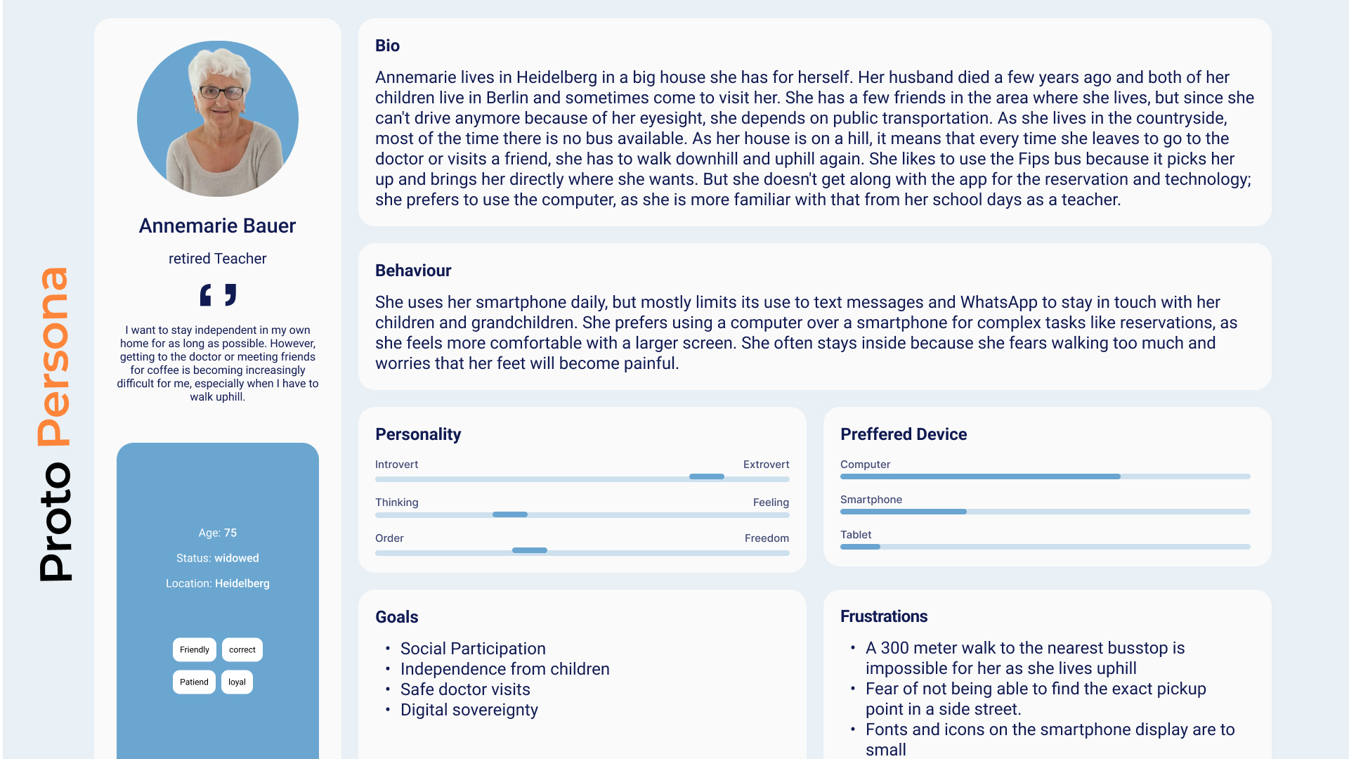
After secondary research on how seniors interact with digital products, I ran remote interviews with 10 seniors (65+) from the Rhein-Neckar region who had used Fips once and stopped. A familiar person helped each of them join the call. Questions were open, neutral and focused on real past experiences. We stopped once answers started repeating.
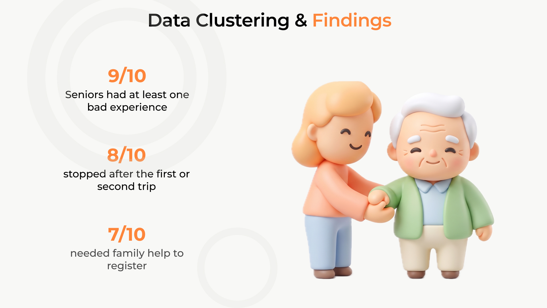
9/10
had at least one bad experience
7/10
needed family help to register
8/10
stopped after the first or second trip
04 · Diagnosis
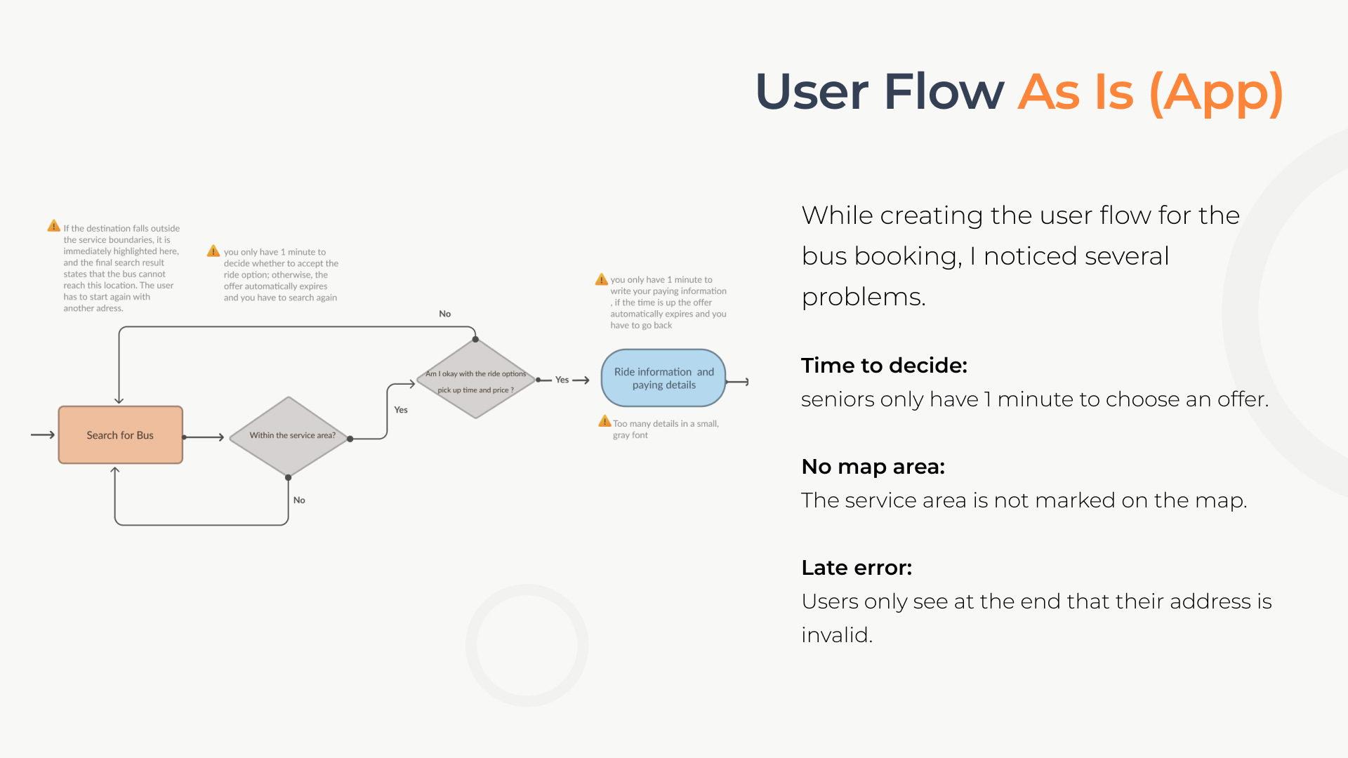
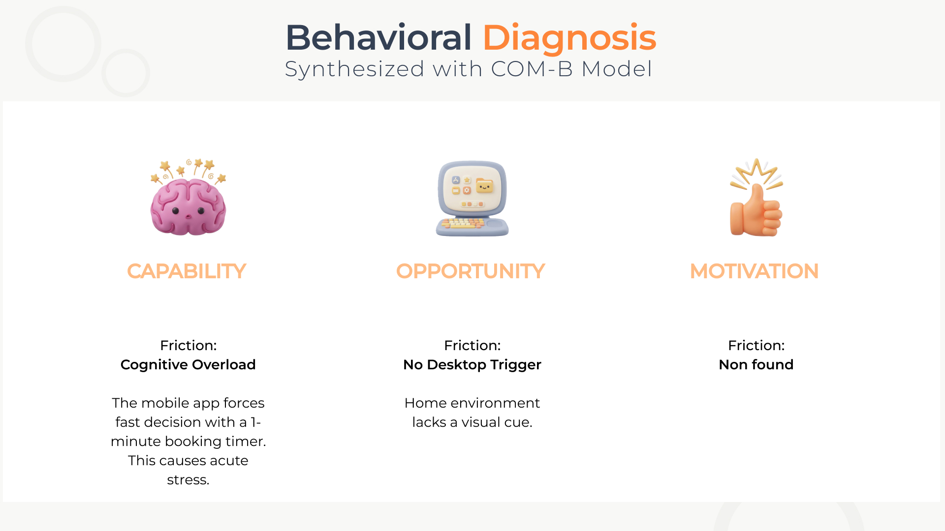
Mapping the as-is app flow revealed three problems: seniors had only one minute to choose an offer, the service area wasn’t marked on the map, and an invalid address was only flagged at the very end.
05 · Choice architecture
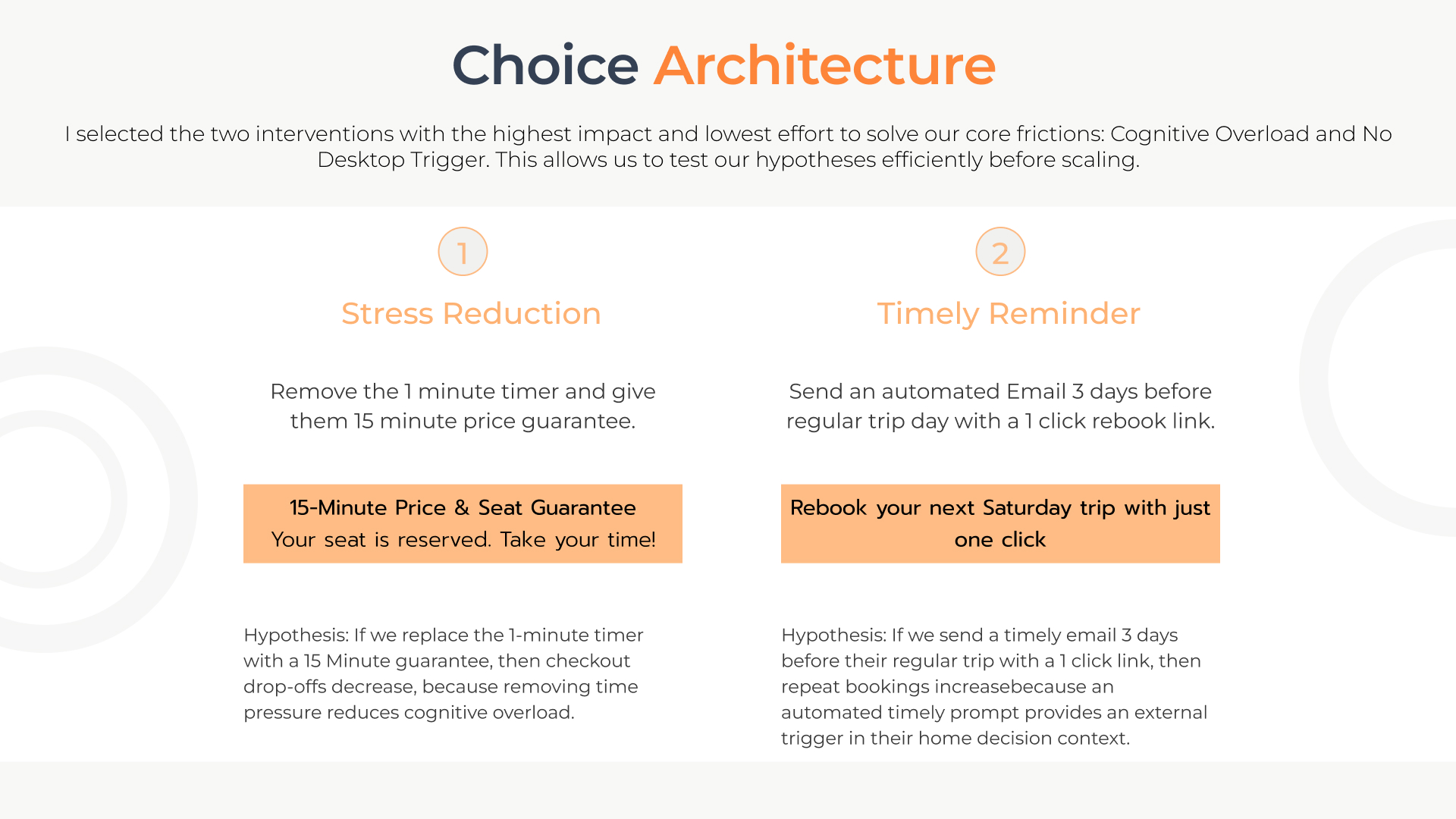
1
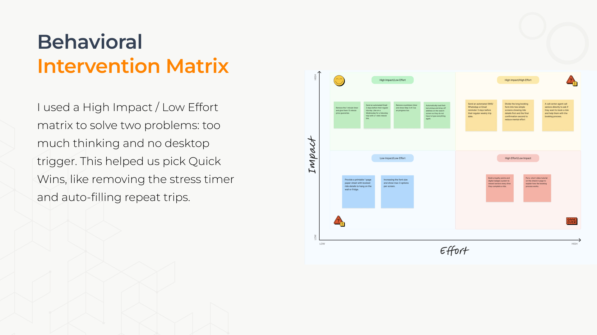
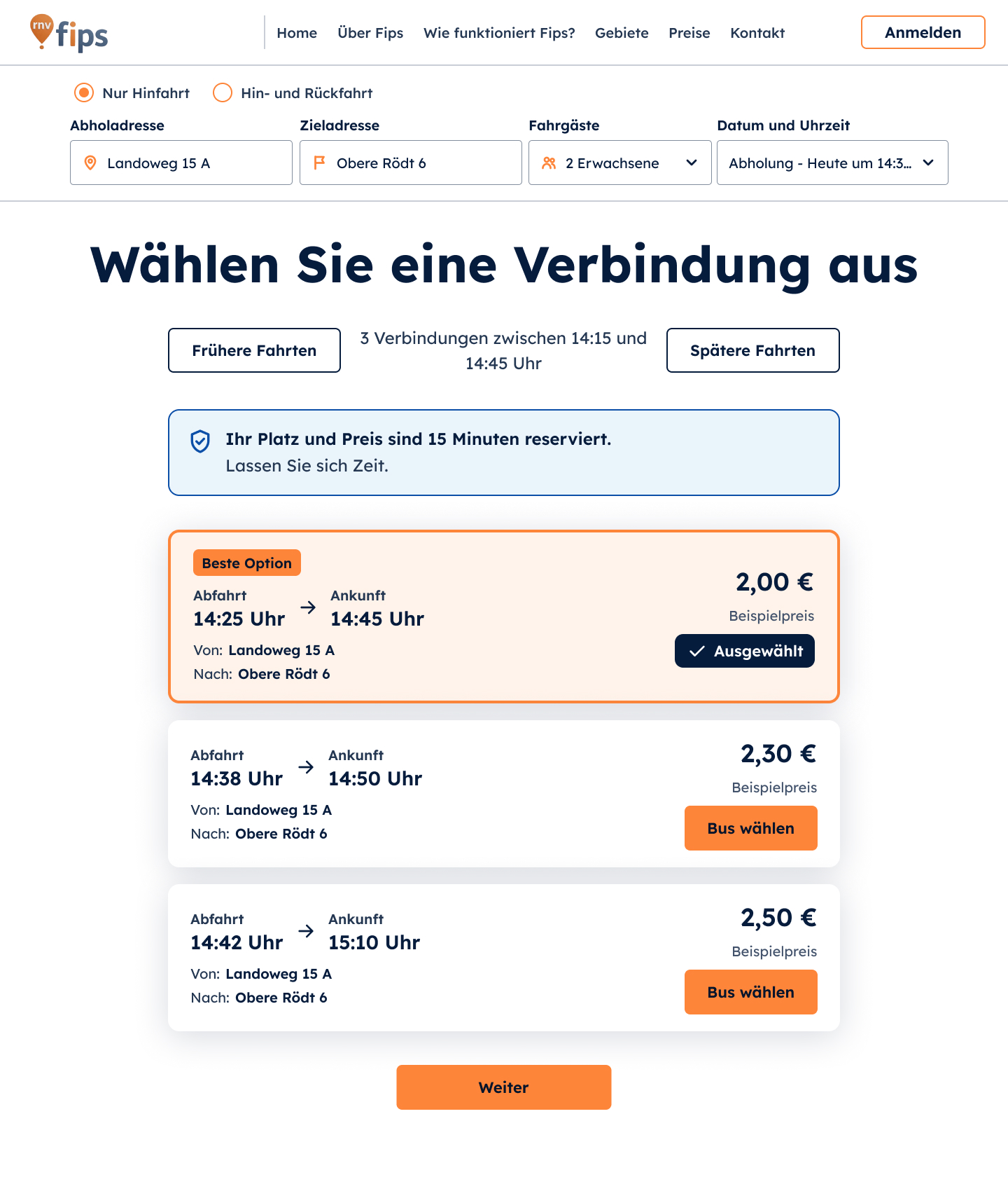
Replace the 1-minute timer with a 15-minute price & seat guarantee: “Your seat is reserved. Take your time!”
Hypothesis: removing time pressure reduces cognitive overload, so checkout drop-offs decrease.
2
An automated email 3 days before the regular trip day with a one-click rebook link.
Hypothesis: an external trigger in the home decision context increases repeat bookings.
06 · Experiment design
Status: I tested the proposed solution with users. The two KPIs are hypotheses that can only be measured once the new flow is live.
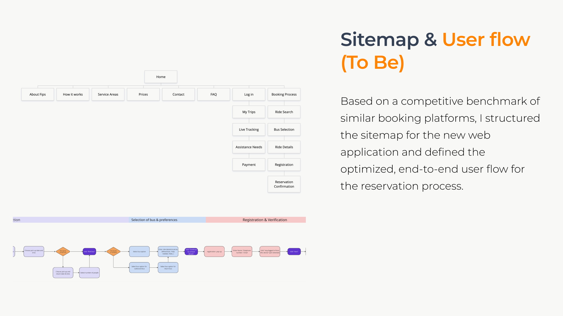
07 · Information architecture & wireframes
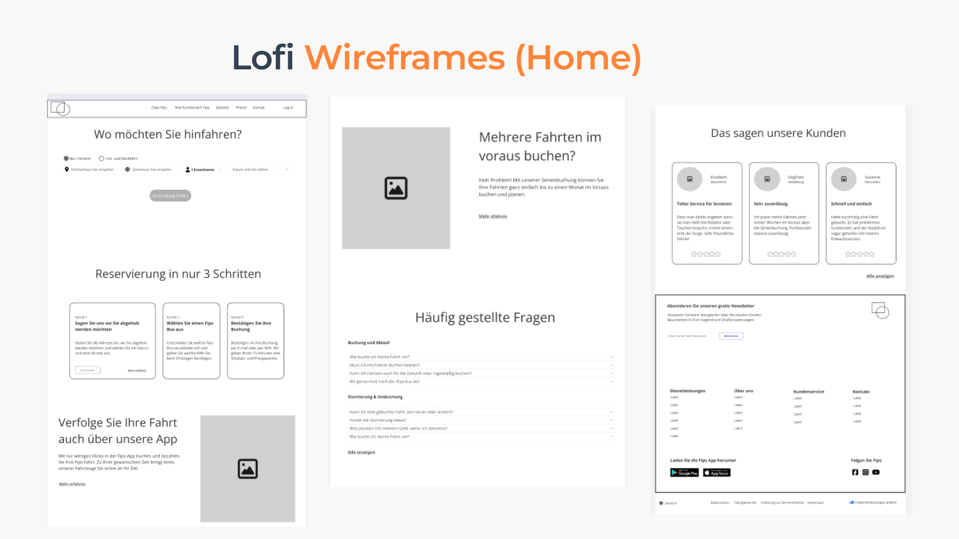
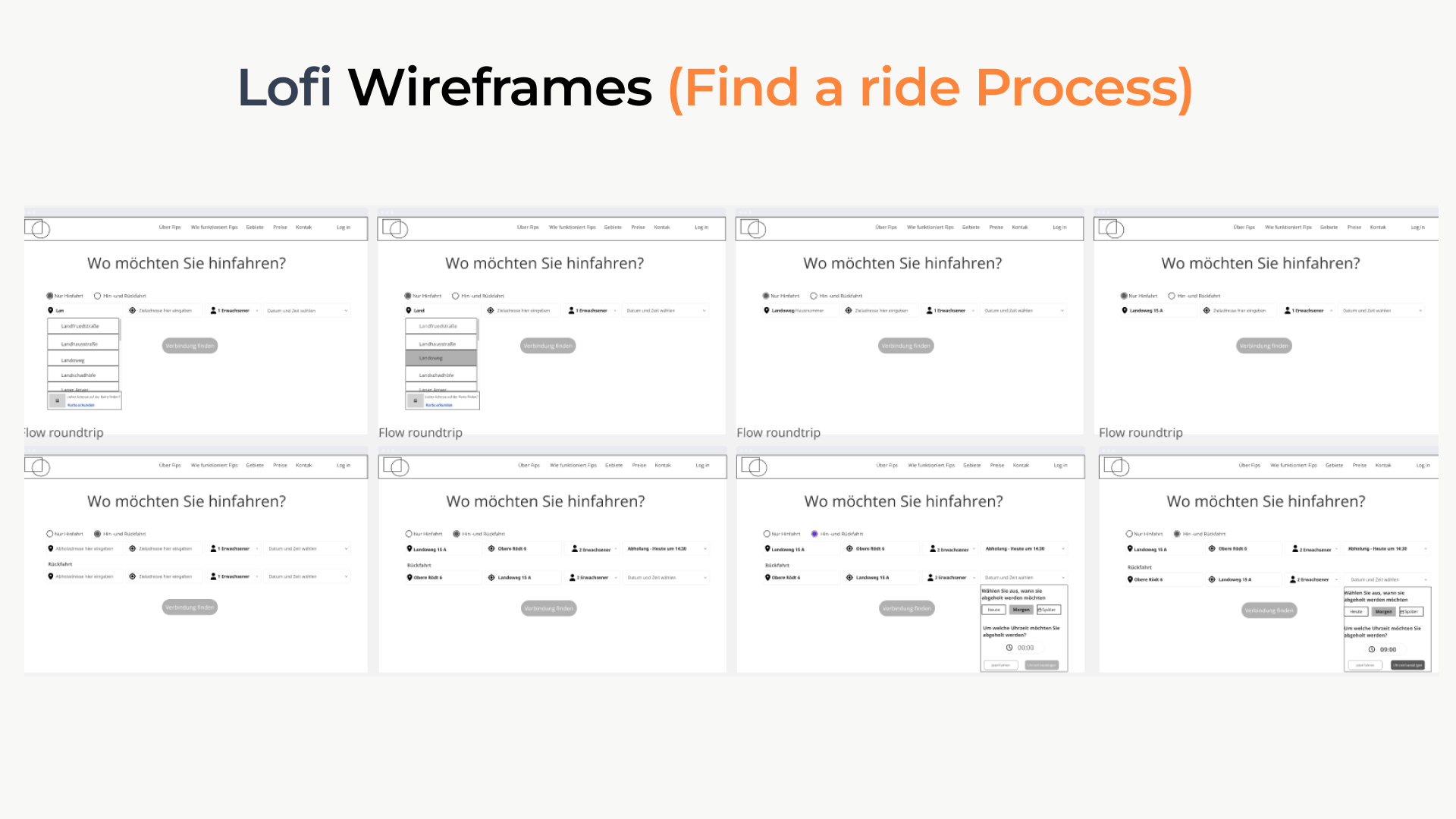
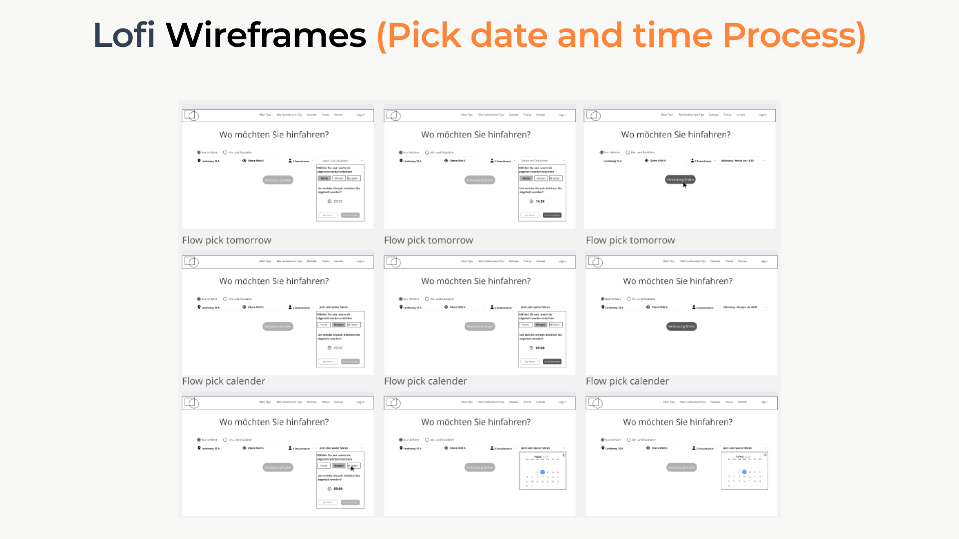
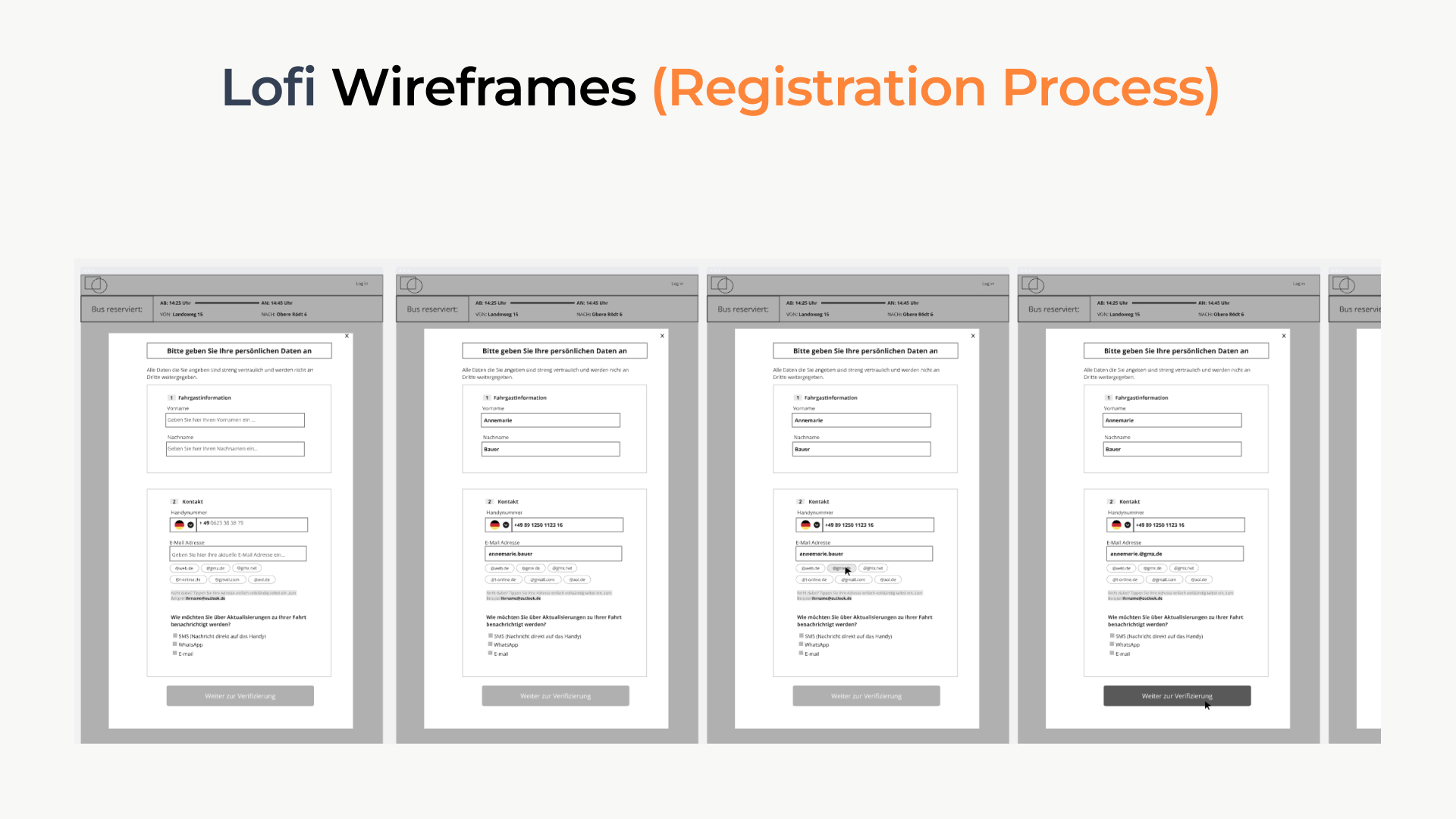
08 · Final design
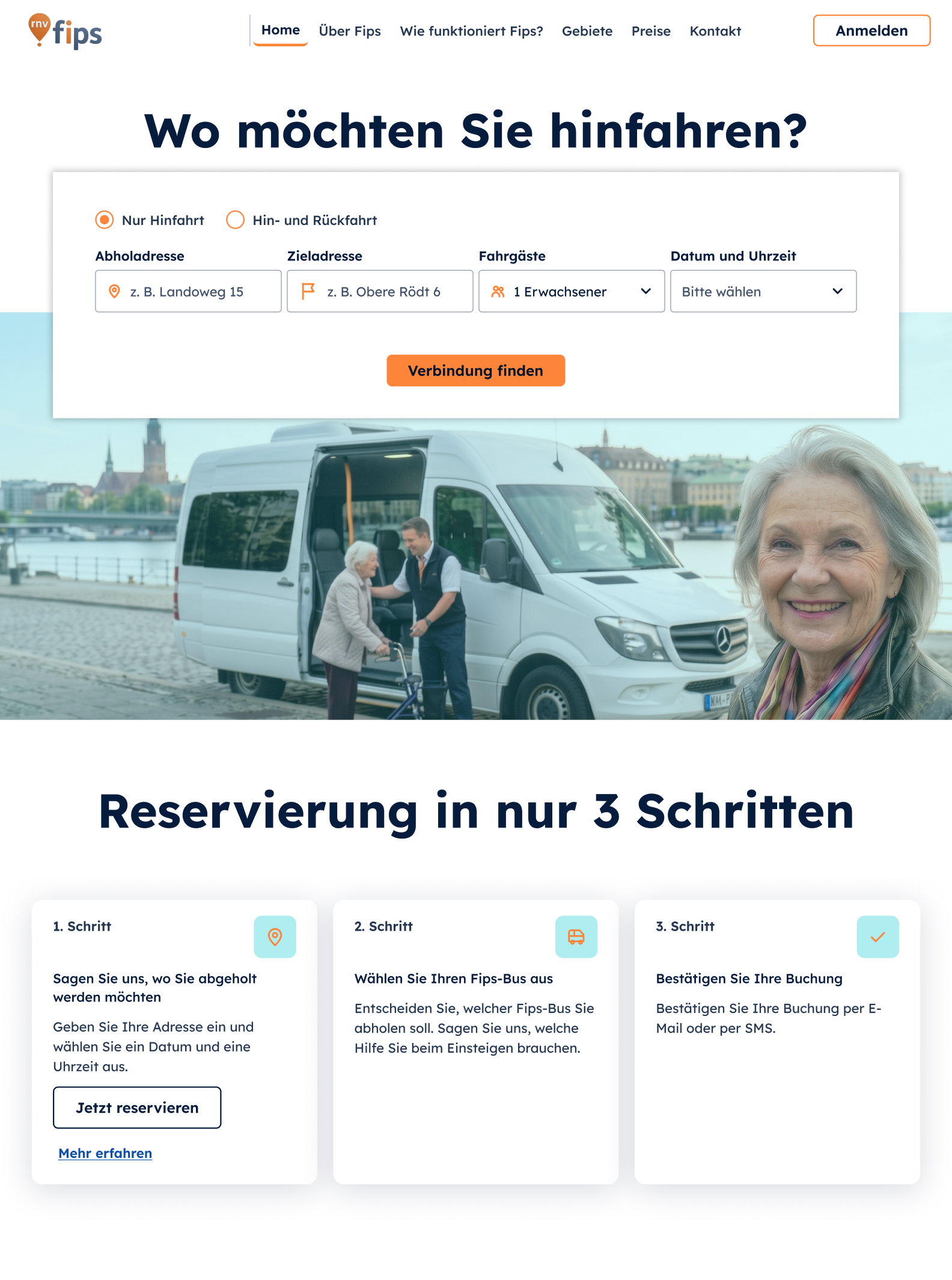
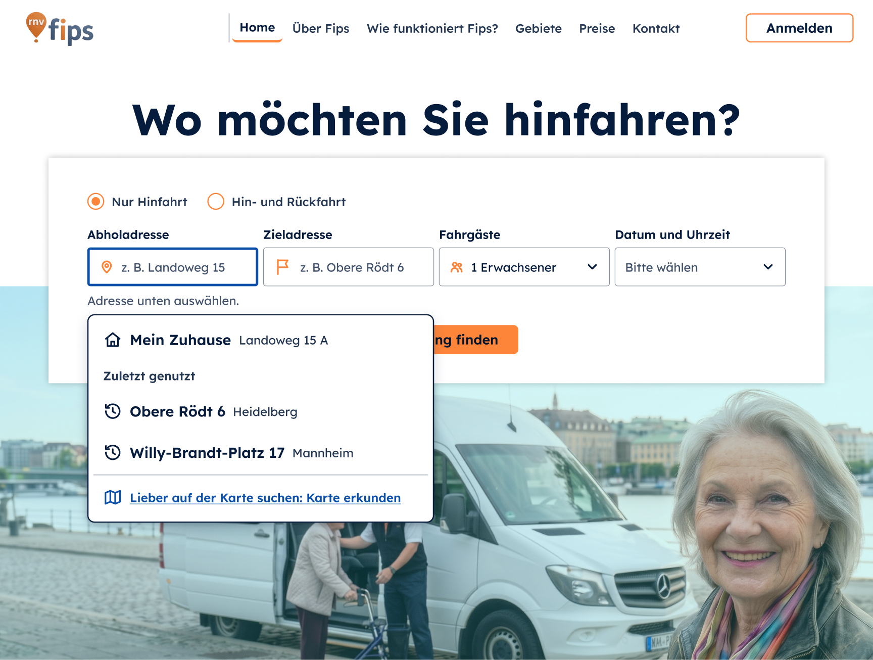
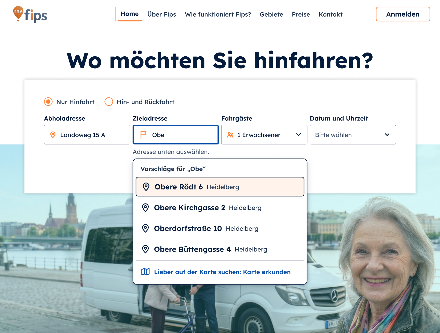
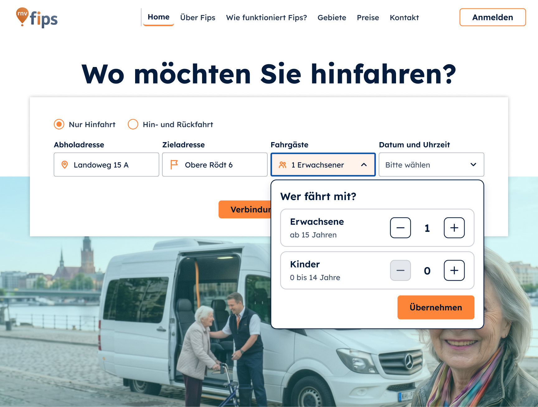
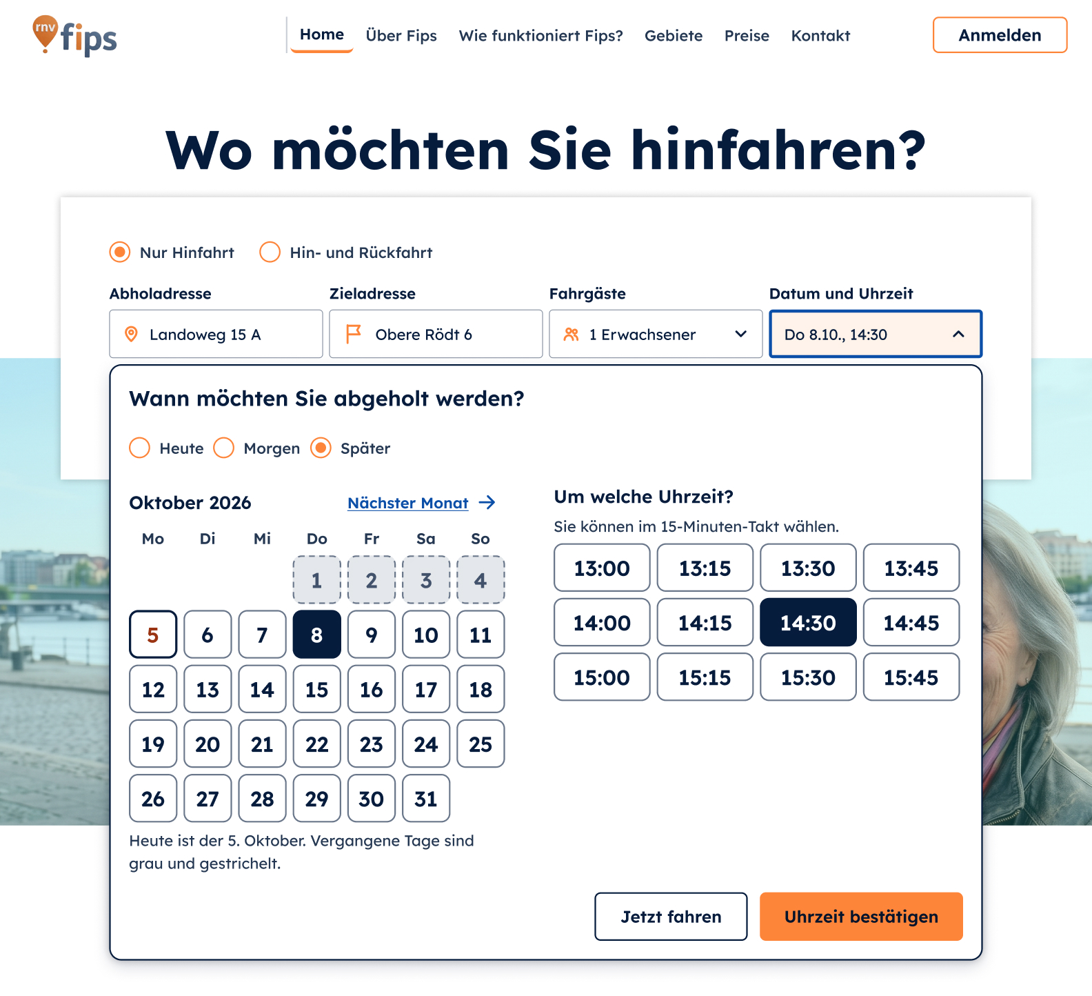
The hi-fi web version turns the research into the interface: large type and touch targets, one decision per step, and the two interventions built right into the flow.
09 · UI decisions
I built a small design system for the booking flow. These are the decisions behind it.
20 px
Smallest text
Body 20 px, buttons 22 px, in Lexend, a typeface made for readability.
64 px
Buttons & fields
Large click areas: for radio buttons the whole row is clickable.
7.5 : 1
Minimum text contrast
All text colors meet WCAG AAA and are documented in the design system.

White on our orange would only reach 2.4 : 1. Navy text reaches 7.5 : 1. Every button has normal, hover, focus, disabled and loading states.
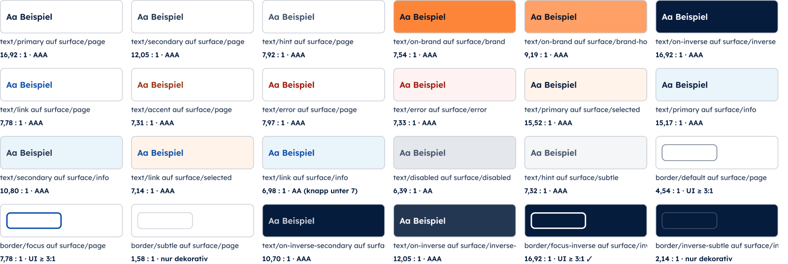
All colors are variables, and every text-on-background pair is listed with its contrast ratio.
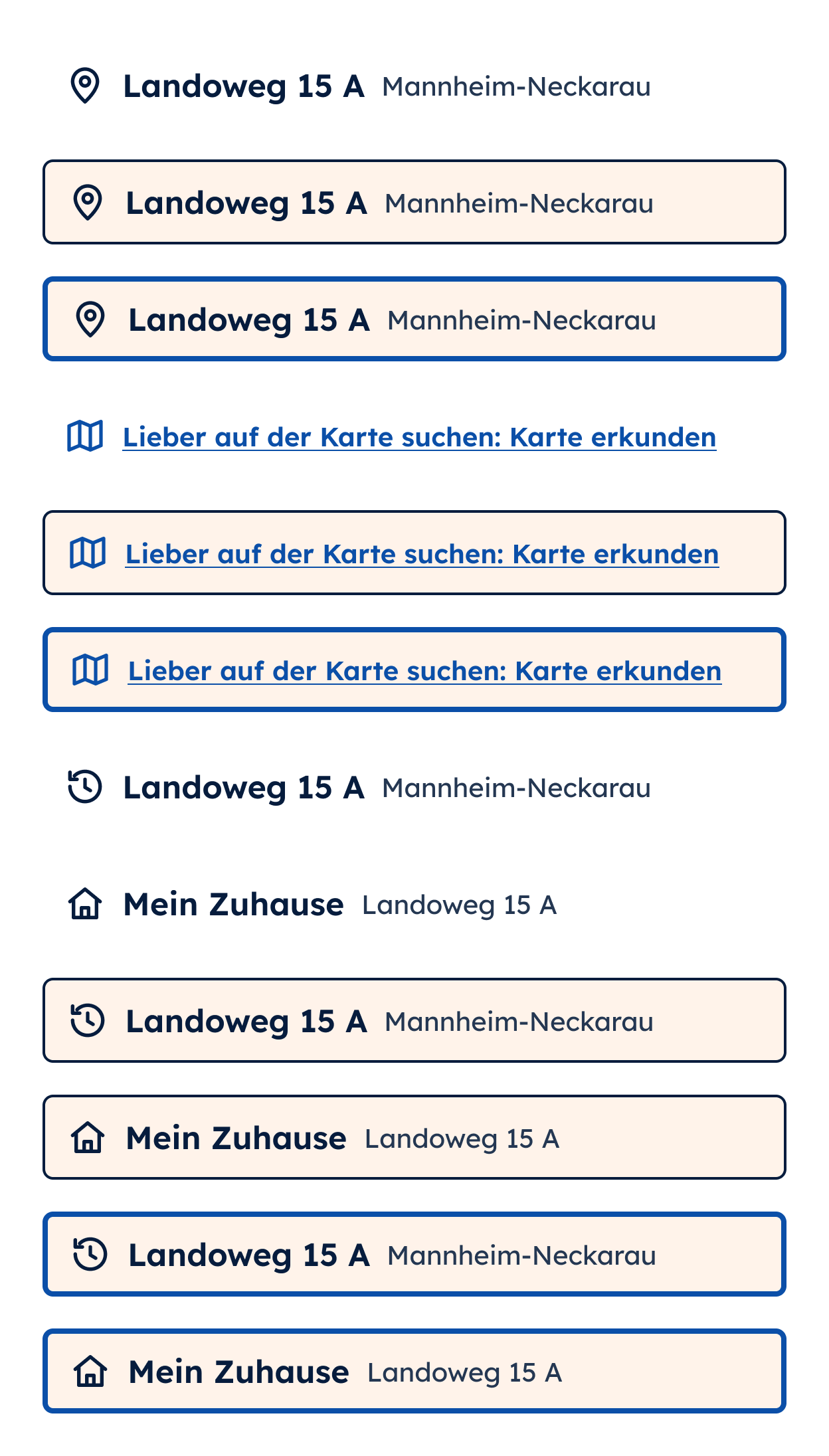
Suggestions are full 64 px rows including the house number, so there is no extra step. “My home” and recent addresses come first.
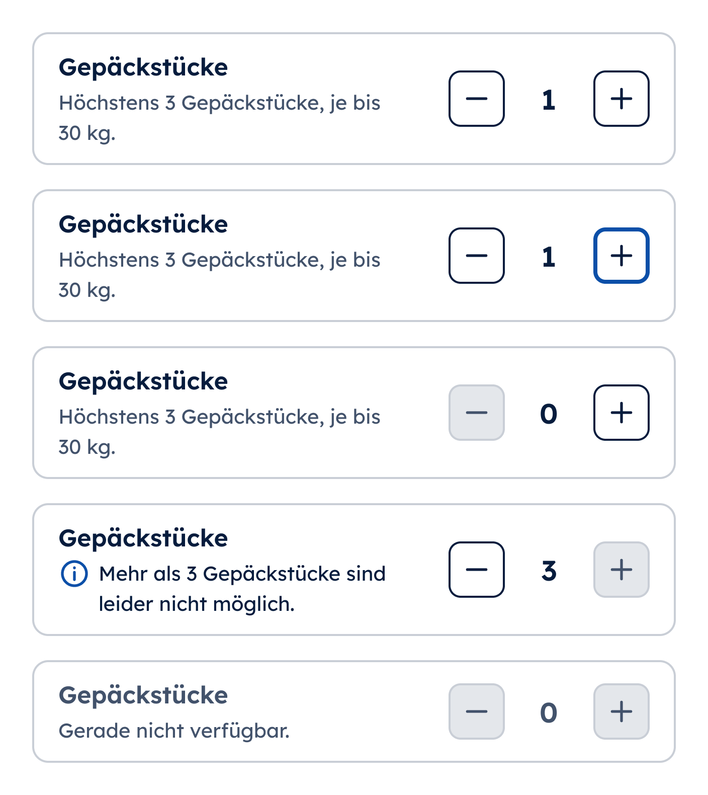
56 px plus and minus buttons, 28 px numbers and a sentence instead of a silently greyed-out button.
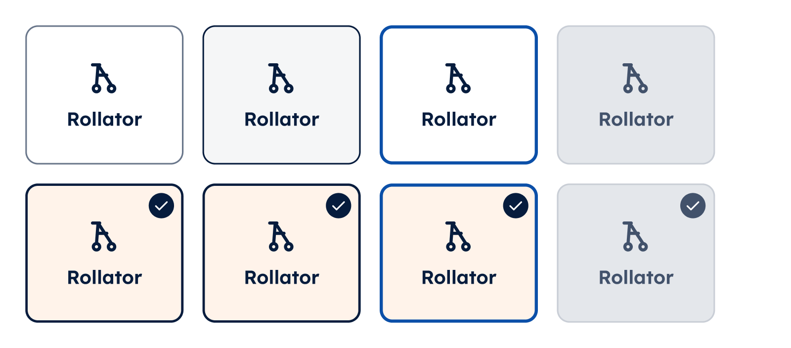
Walker, wheelchair or luggage as large tiles, easier to hit and to understand than small checkboxes.
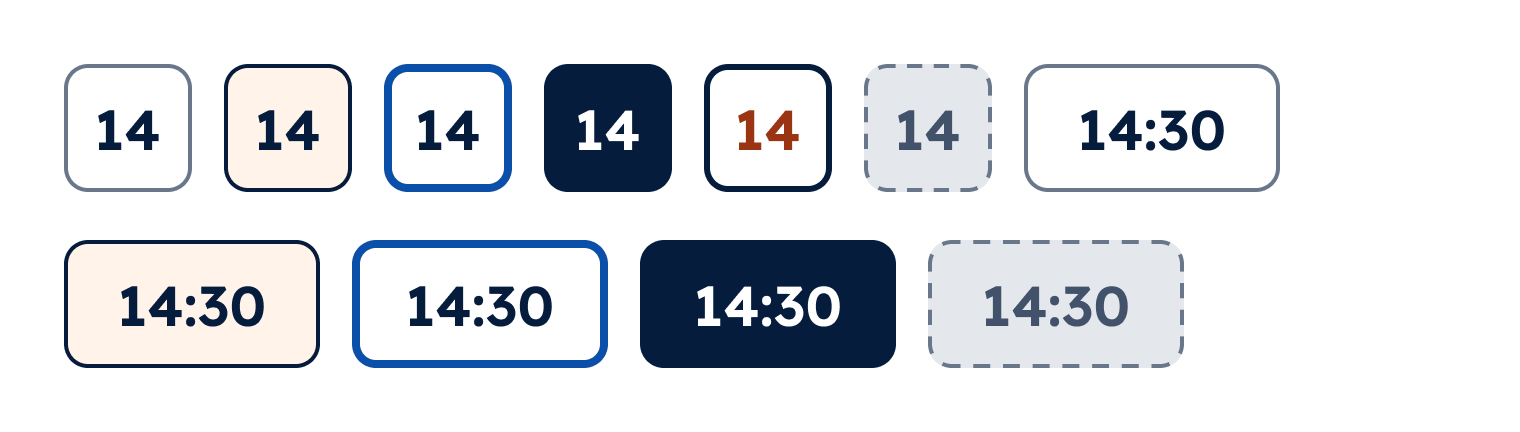
Times as 128 × 64 px cells: one click instead of scrolling through a list.
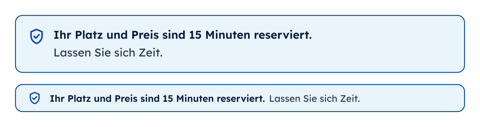
“Your seat and price are reserved for 15 minutes. Take your time.” No timer and no red, because time pressure was a key reason seniors gave up.