In short
Context
The agency’s website was meant to turn visitors into inquiries, but the team wasn’t aware of the usability issues standing in the way.
What I did
A UX audit of 4 key screens, 12 findings grouped into 6 problem areas and an implementation brief with clear priorities and guardrails.
Outcome
The agency rebuilt its website based on the brief. 5 of the 6 problem areas are solved on the live site.
My role in this project
What I owned
- The complete UX audit (expert review)
- 12 findings in 6 problem areas
- Priorities and the implementation brief
Implemented by the client
- The agency rebuilt its website based on my recommendations
Method
- Expert review: the findings have not yet been tested with users
01 · Objective
What every visitor should be able to do.
Before looking at any screen, I defined what the website has to achieve from the visitor’s point of view. A visitor should be able to:
- understand what the agency offers within the first few seconds,
- see the value of the services for their own business,
- identify the next step without confusion,
- navigate the website intuitively,
- read all important content comfortably,
- trust the company through clear information and credible testimonials,
- get in touch with as little friction as possible.
Business goal: more qualified visitors become customer inquiries.
02 · Audit
12 findings, 6 problem areas.
I went through the website like a first-time visitor and documented every friction point directly on the screens. Then I grouped the 12 findings into six problem areas.
A
Unclear value proposition
The first viewport doesn’t say what the agency offers or what customers gain from it.
B
Unclear CTA hierarchy
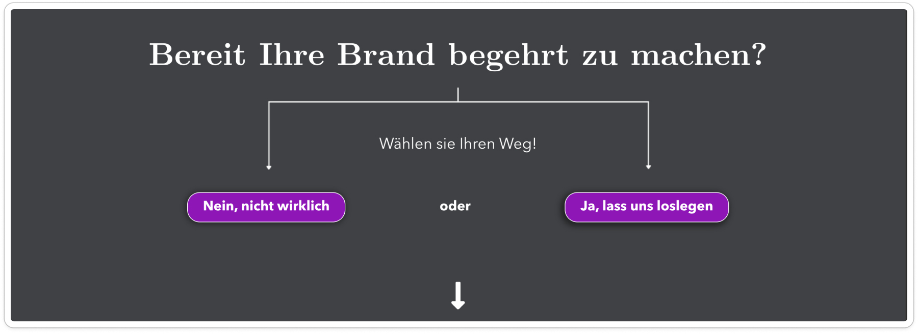
Competing buttons such as “Mehr Informationen” vs. “Kostenlose Accountanalyse” or “Nein” vs. “Ja” distract from the main goal.
C
Contrast & readability
Low-contrast logo, text over images, long paragraphs that are hard to read while scrolling.
D
Competing visual elements
Dark backgrounds, heavy shadows, videos and moving images fight with the main message.
E
Unpredictable navigation
Scrolling changes direction, so users can’t predict what comes next or where to look.
F
Weak trust signals
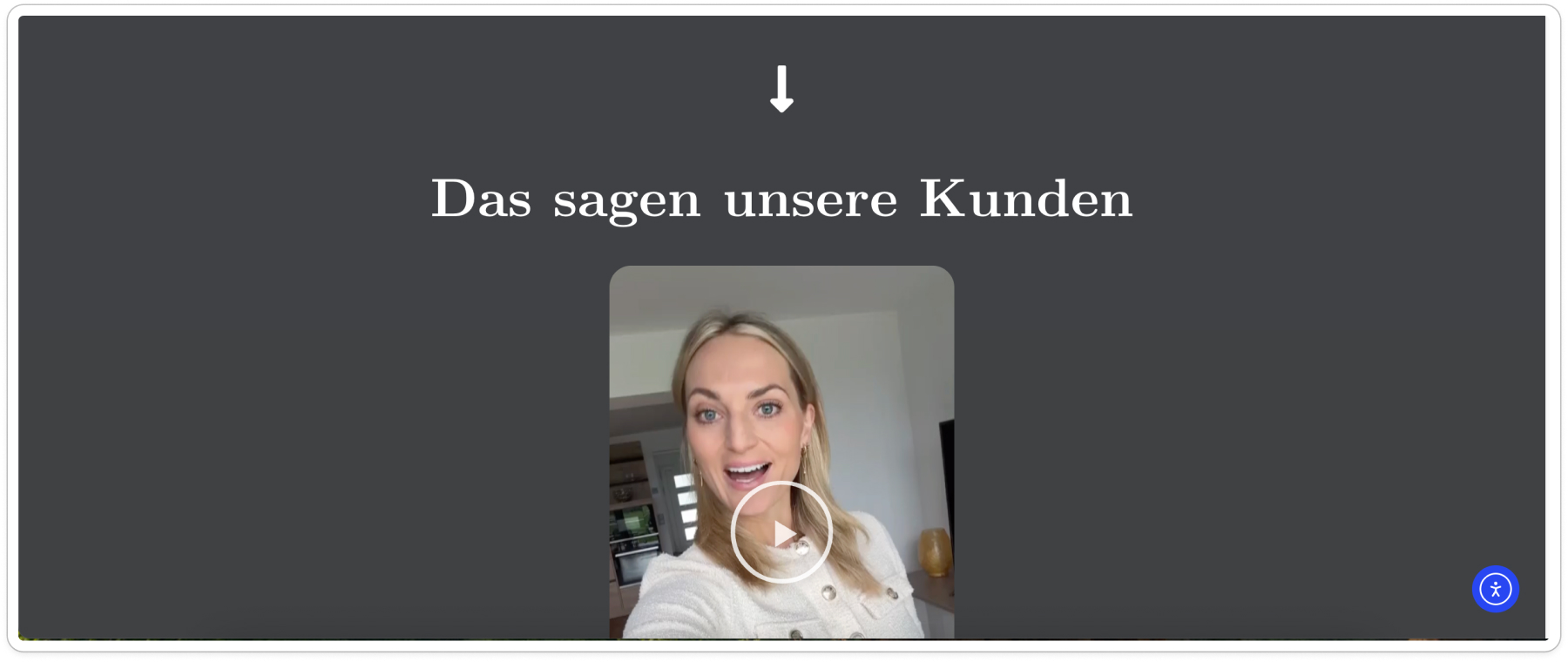
A single testimonial video, without making clear who is speaking and what it proves.
03 · Implementation brief
A clear plan for the redesign, with priorities and guardrails.
I turned the findings into an implementation brief: which problems to fix first, how to fix them, and what must not happen along the way.
Priorities
- Conversion clarity: clear value proposition, one primary call to action, simpler decisions, a working path to contact.
- Readability & usability: WCAG 2.2 AA contrast, typography, content hierarchy, navigation and scrolling.
- Trust & refinement: testimonial presentation, consistent spacing, responsive details.
Guardrails
- Improve the existing site and keep the brand identity, content and working forms.
- No manipulative choice architecture. Users must still be free to decline.
- No unsupported promises, invented testimonials or fake results.
- Test every change on desktop, tablet and mobile.
04 · Before & after
Four screens, before and after the redesign.
For each screen: what I found, which problem area it belongs to, and how the new website solves it.
Screen 1 · Hero
The first 10 seconds.
Before
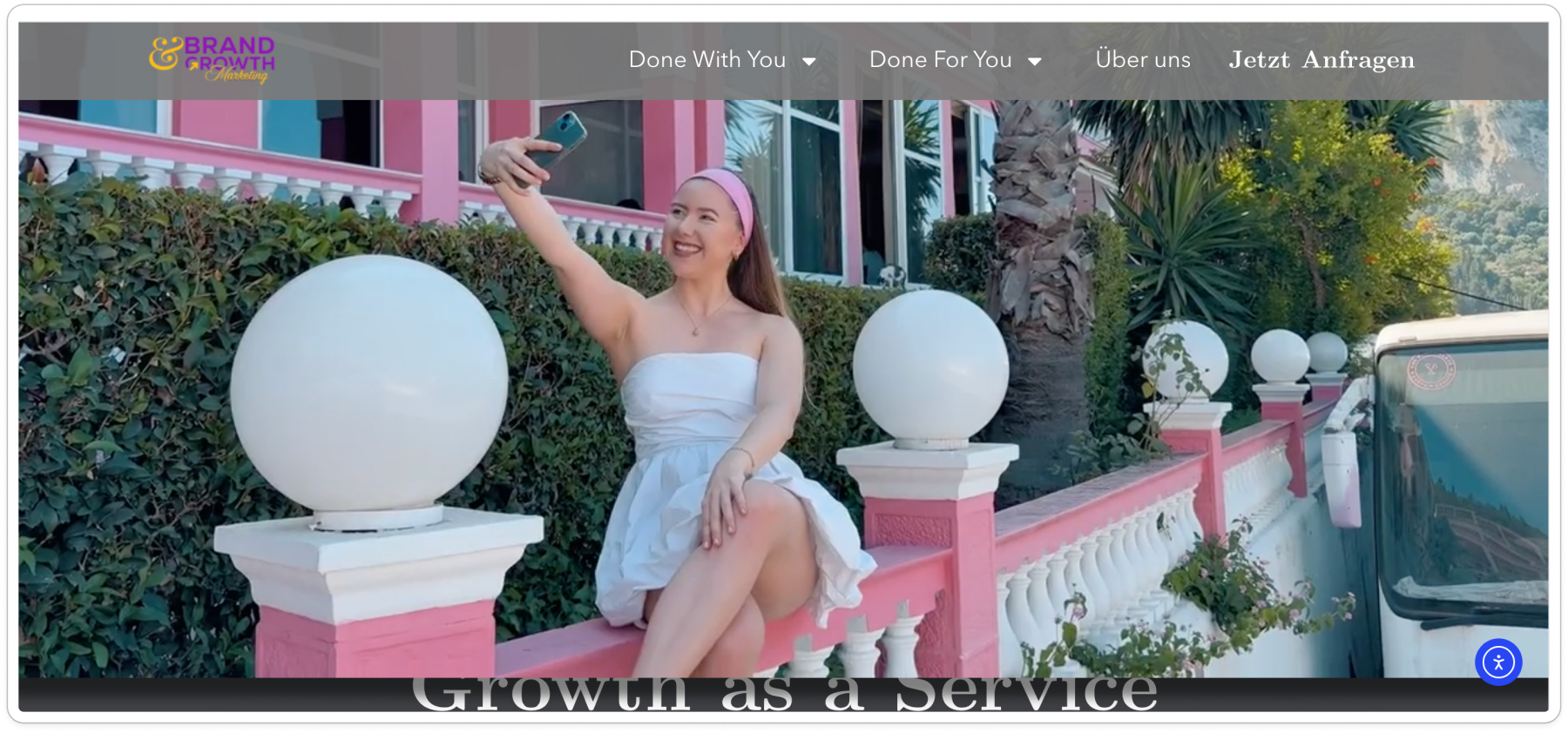
What I found
- A · Above the fold there is no information about what the agency offers, so visitors learn nothing in the first 10 seconds.
- D · The goal seems to be a click on “Jetzt anfragen”, but the video pulls all the attention.
- C · The logo doesn’t have enough contrast, which hurts readability.
- A · My copy suggestion: a headline with a concrete benefit, the platforms in the subline and one clear call to action.
After
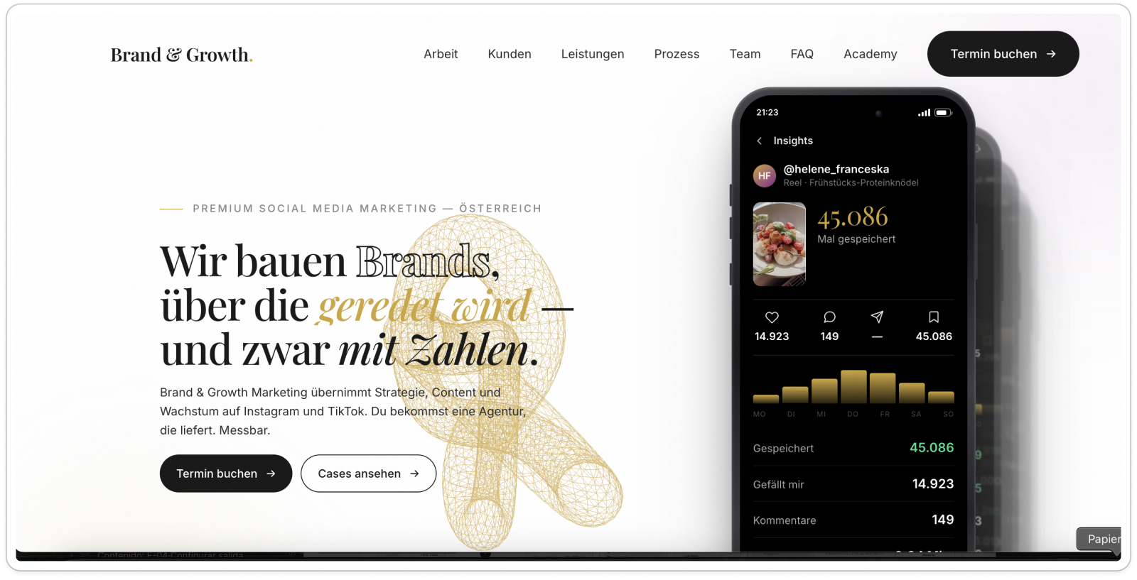
The new hero says right away what the agency does (strategy, content and growth on Instagram and TikTok) with one main action: “Termin buchen”.
Screen 2 · Services
Information people can actually read.
Before
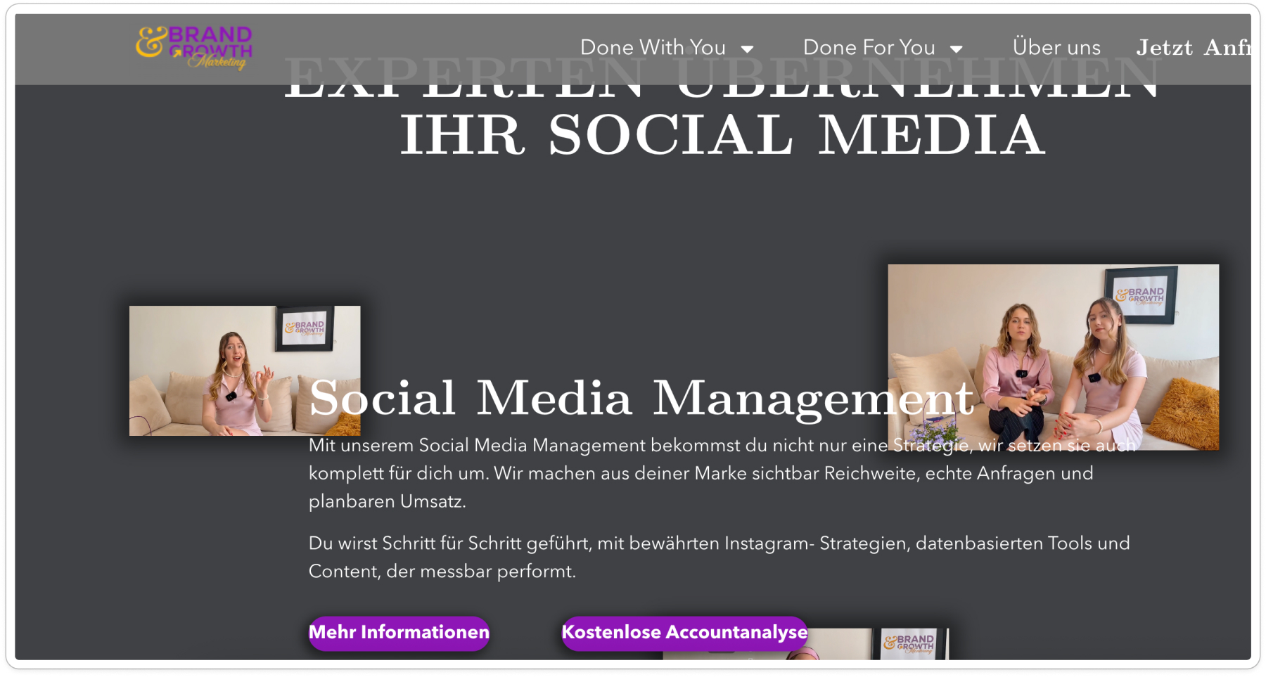
What I found
- B · “Mehr Informationen” and “Kostenlose Accountanalyse” are equally strong, so users don’t know which one to click.
- C · Text placed over images loses contrast and can’t be read while scrolling.
- D · The moving images draw more attention than the information.
- C · The information is packed into too much text. Users don’t read, they scan.
- E · Scrolling changes direction unexpectedly, so users can’t predict what comes next or where to look.
- D · On the dark background, the extra shadows on images and buttons make the page feel overloaded.
After
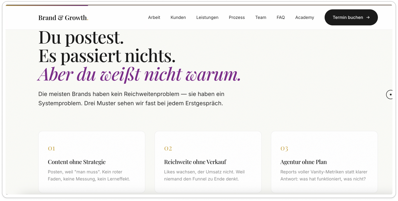
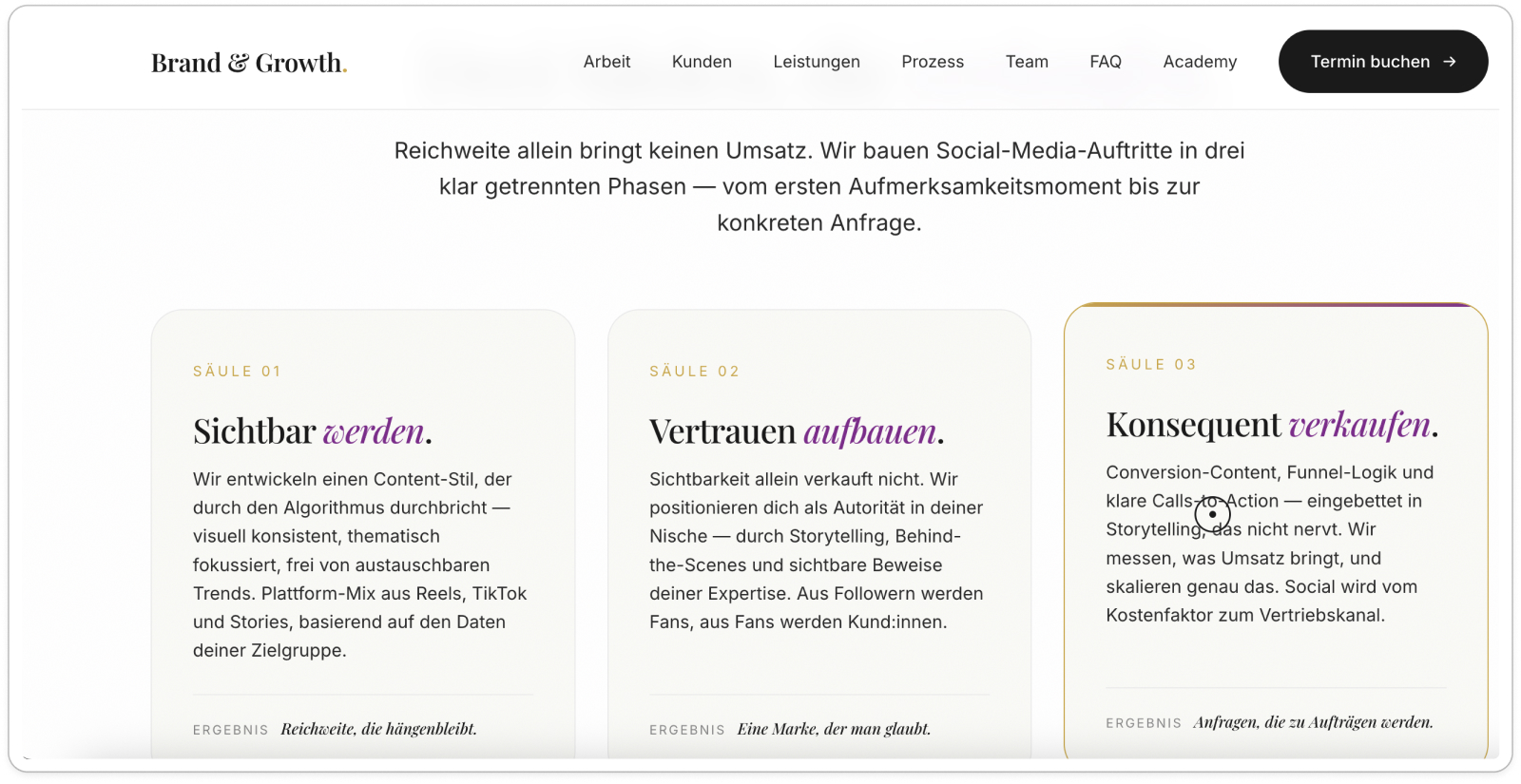
A light, calm layout with short, scannable blocks: the visitor’s problem first, then the services as three clear pillars.
Screen 3 · Call to action
Don’t offer a “No”.
Before
What I found
- B · Two main buttons offer “Nein, nicht wirklich” and “Ja, lass uns loslegen”. A primary button that leads to “No” breaks the path to an inquiry. One clear next step works better, while users stay free to simply leave.
After
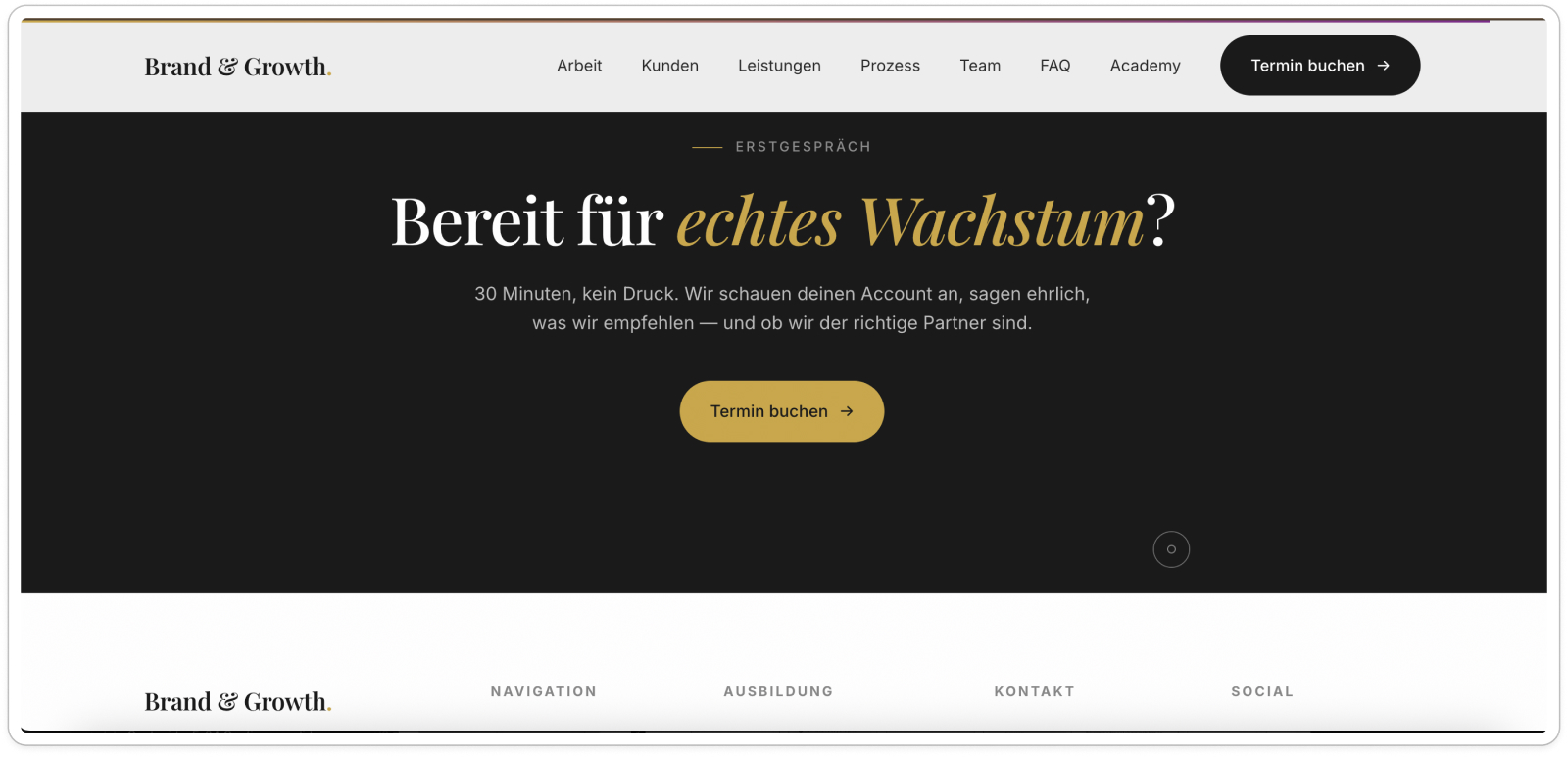
One confident call to action, “Termin buchen”, with a short, reassuring text.
Screen 4 · Testimonials
Make trust visible.
Before
What I found
- F · The video is good, but it’s not clear who is speaking, from which brand, and what the client says about the agency.
- F · A single testimonial isn’t enough to build trust. More client references are needed.
After
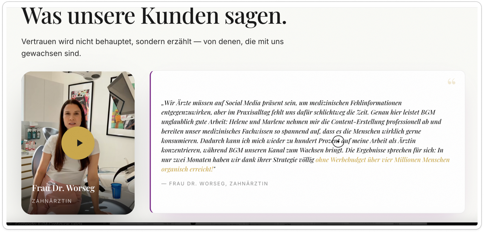
The client’s name and role are now visible, with the key statement written out next to the video.
05 · Result
What the new website does differently.
The agency rebuilt its website based on the brief. These problem areas are now solved on the live site:
- A · Value proposition: the hero says what the agency does and on which platforms.
- B · CTA hierarchy: one primary action, “Termin buchen”, instead of competing buttons and a “Nein / Ja” choice.
- C · Readability: light background, no text over images, short scannable blocks.
- D · Visual hierarchy: the message leads each section; videos and images support it.
- F · Trust: the testimonial now shows who is speaking and what the client says.
Expected impact · hypothetical scenario, not yet measured
What the redesign is expected to change
+12 %
Conversion rate
Through clearer CTAs and better guidance.
−15 %
Bounce rate
Assuming content and navigation better match what visitors expect.
−20 %
Time on task
Less time to find key information or send an inquiry.