← All projects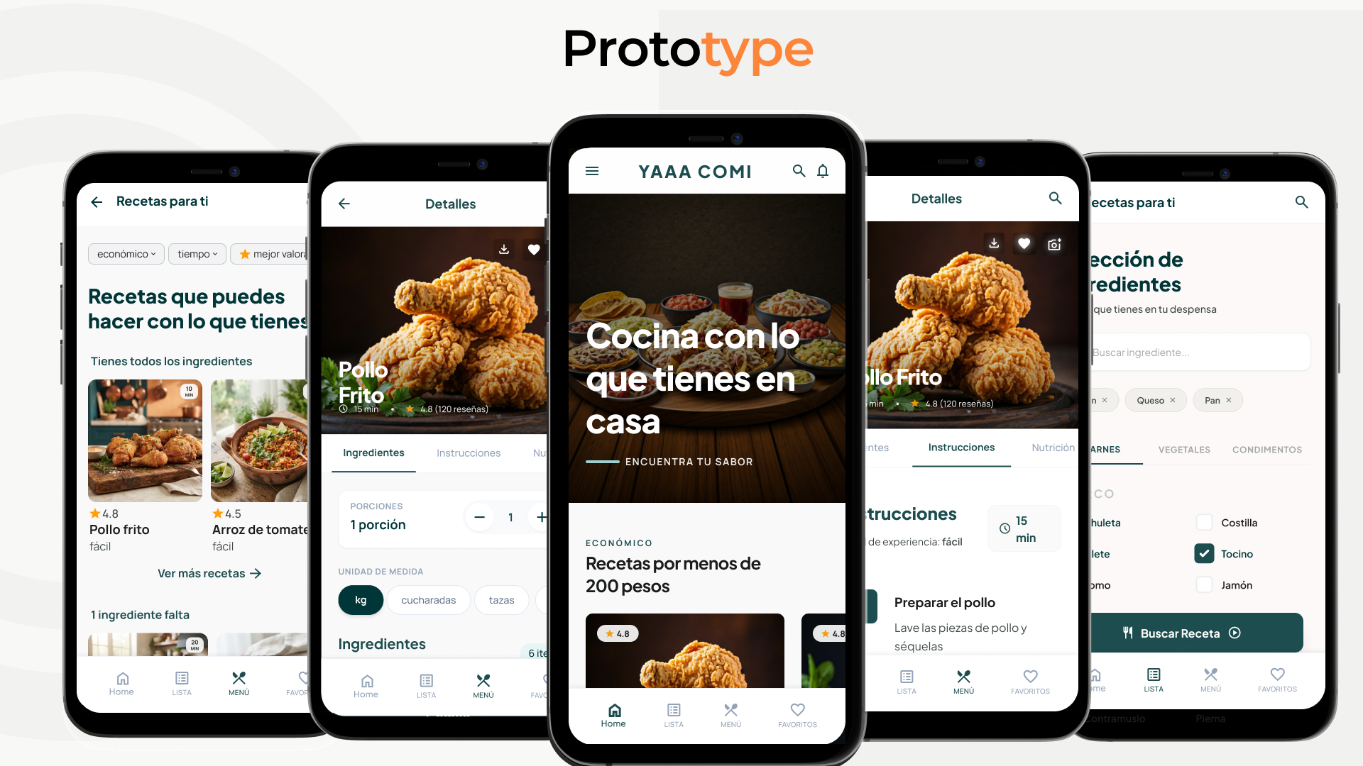
Case study · Mobile App · UX/UI
YAAA COMI
A cooking app for young people who want to save time and money: easy meals at the lowest possible cost, with smart suggestions on how to save on ingredients.
Case study · Mobile App · UX/UI
A cooking app for young people who want to save time and money: easy meals at the lowest possible cost, with smart suggestions on how to save on ingredients.
In short
Problem
Students with little time and money eat cheap instead of well, and recipes feel complicated.
What I did
12 interviews, persona, user flow, How-Might-We, wireframes, hi-fi prototype and thinking-aloud usability tests with 6 participants.
Outcome
A tested app prototype: cook with what you have, fewer choices and a guided step-by-step mode, improved in 3 key iterations.
My role in this project
What I did
As a team
Decided by others
01 · Problem
Young people who want to save time and money need an easy way to prepare food at the lowest possible cost, while also receiving suggestions on how to save on ingredients.
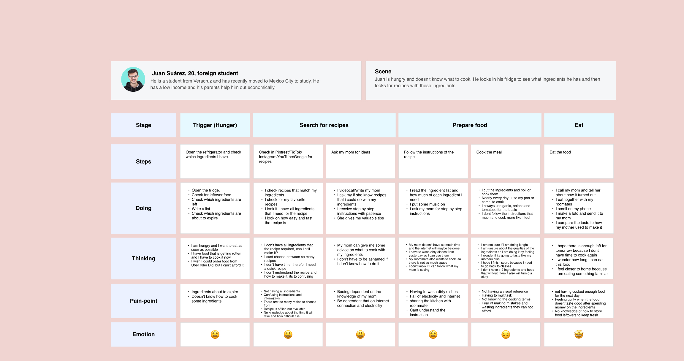
Our users: students aged 18 to 23, Mexican and international, living independently without family support. Like Juan, 20, who moved from Veracruz to Mexico City to study: “I try to eat as cheaply as possible, even if it’s not that tasty.”

02 · Research
We clustered desk research into categories like time optimization, pain points and technology in the kitchen, and benchmarked similar apps and websites for structure, categories and user flows.
For the interviews we drafted 38 questions across six core topics, removed overlaps and ended with a focused list of 21. With these we interviewed 12 students about daily meal planning and the real balance between student budgets and time.
What we heard
The interviews confirmed the two core needs: saving time and saving money. But they also revealed behaviors we hadn't expected:
1
Users screenshot recipes in advance to prepare for unstable internet and power outages at home.
2
Hometown dishes create a strong sense of comfort and connection to family and culture.
3
Users send their results to mom or grandma on WhatsApp instead of posting on social media.
4
When stuck, users call or text their mom for ideas and patient step-by-step instructions.
Risks & certainty
Before designing, we sorted our open questions on a risk / certainty axis. Four risks stood out, and the connection risk directly shaped the design.
1
Can the app be monetized, or is it better to keep it free?
2
What infrastructure does a complex recipe system need?
3
How does the app scale with a growing database and many users?
4
How do we handle bad internet connections in the target region?
03 · Define
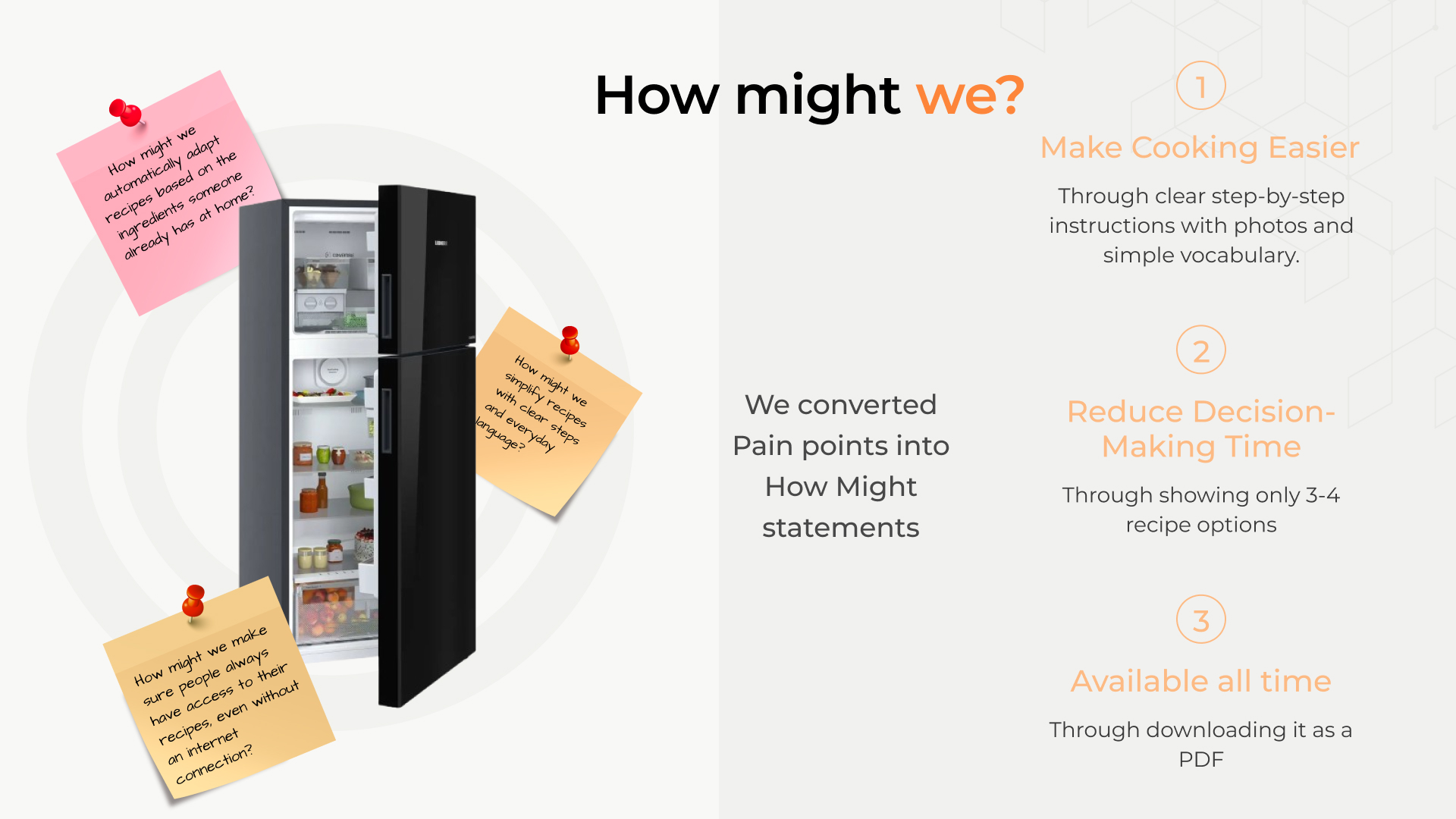
1
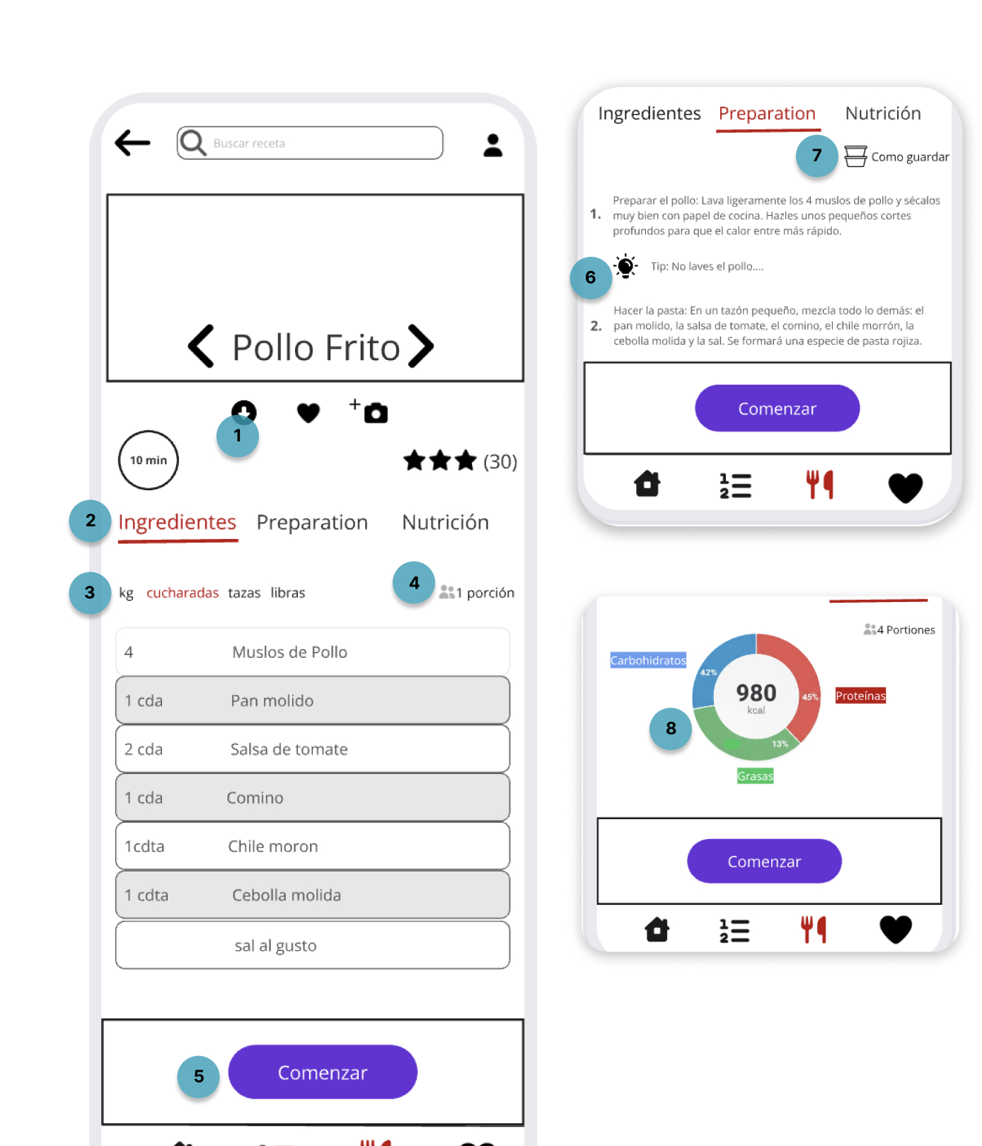
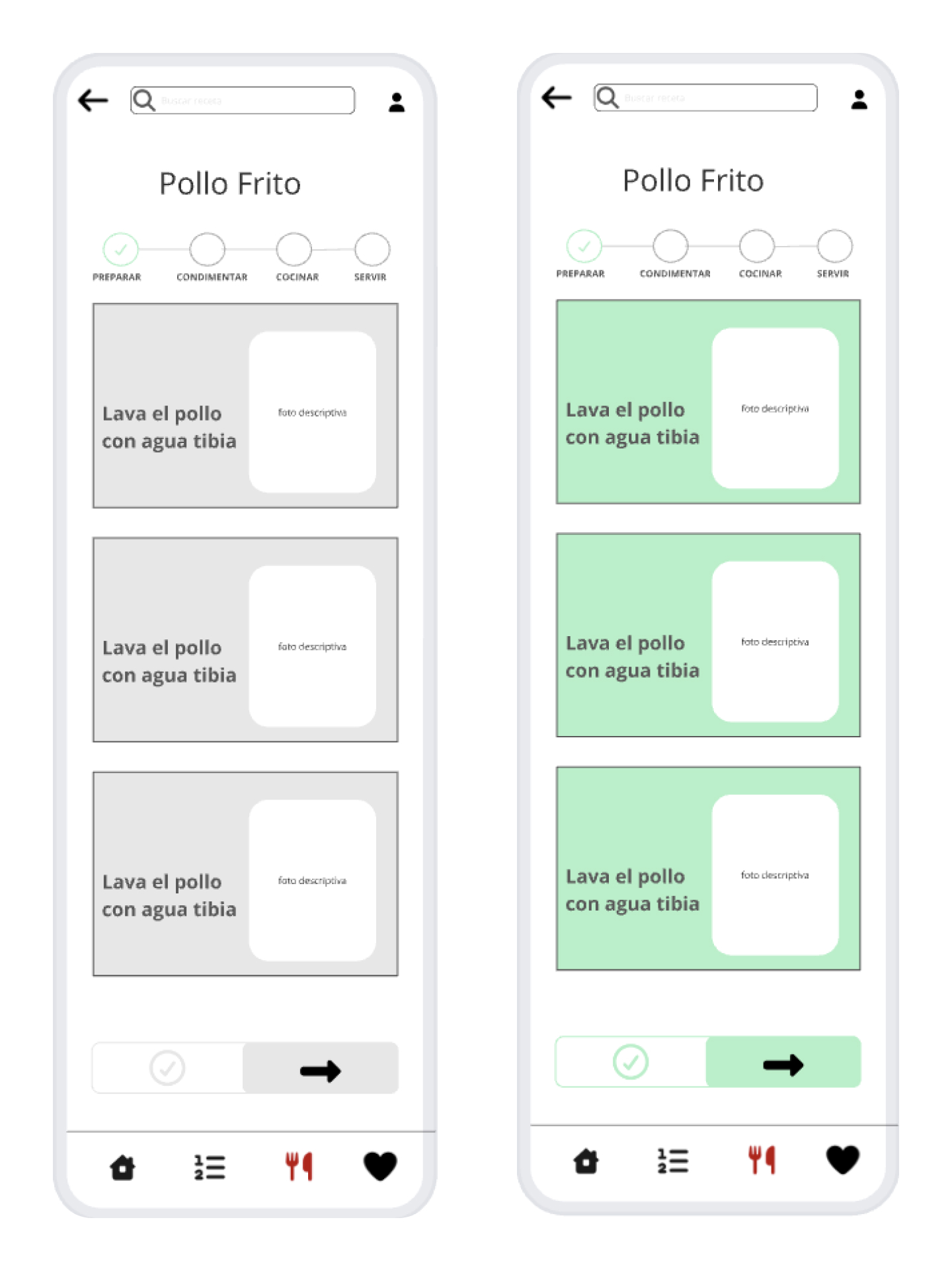
Clear step-by-step instructions with photos and simple vocabulary.
2
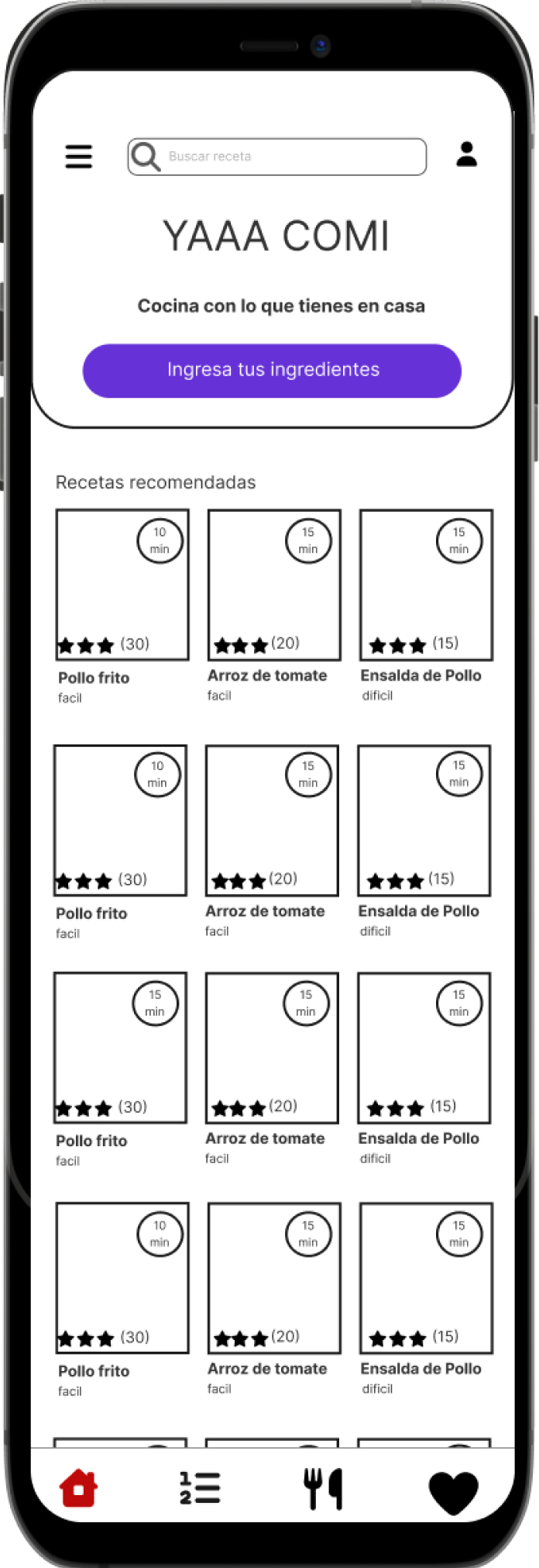
Show only 3 or 4 recipe options at a time.
3
Download recipes as a PDF to cook offline.
4
Ingredient-based search adapts recipes to what’s already at home.
04 · Design
05 · Usability testing
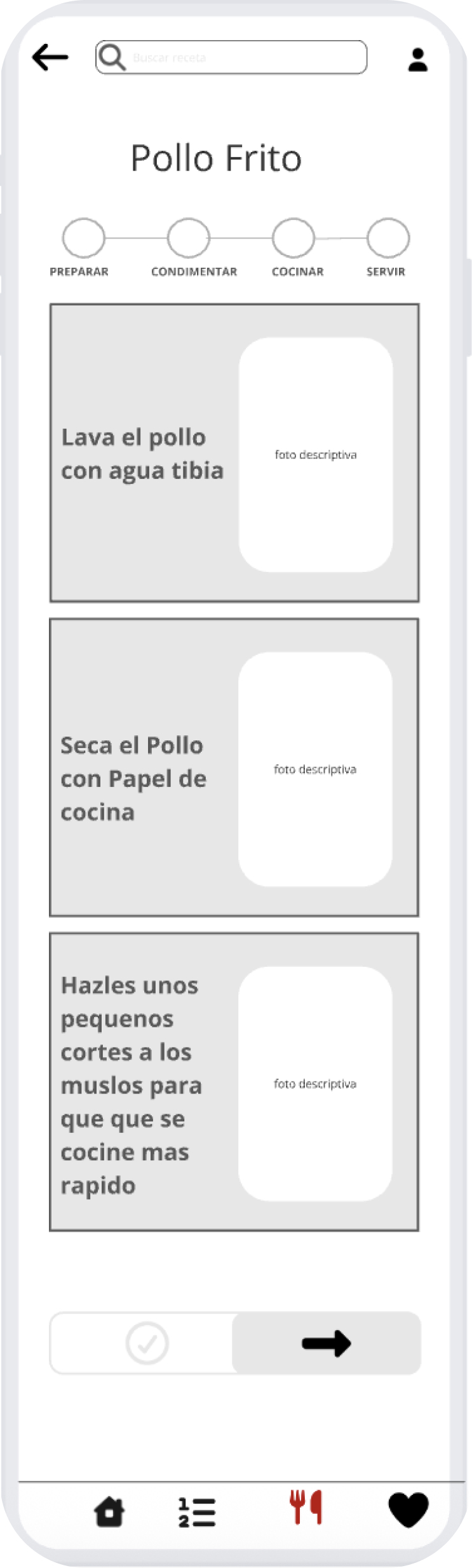
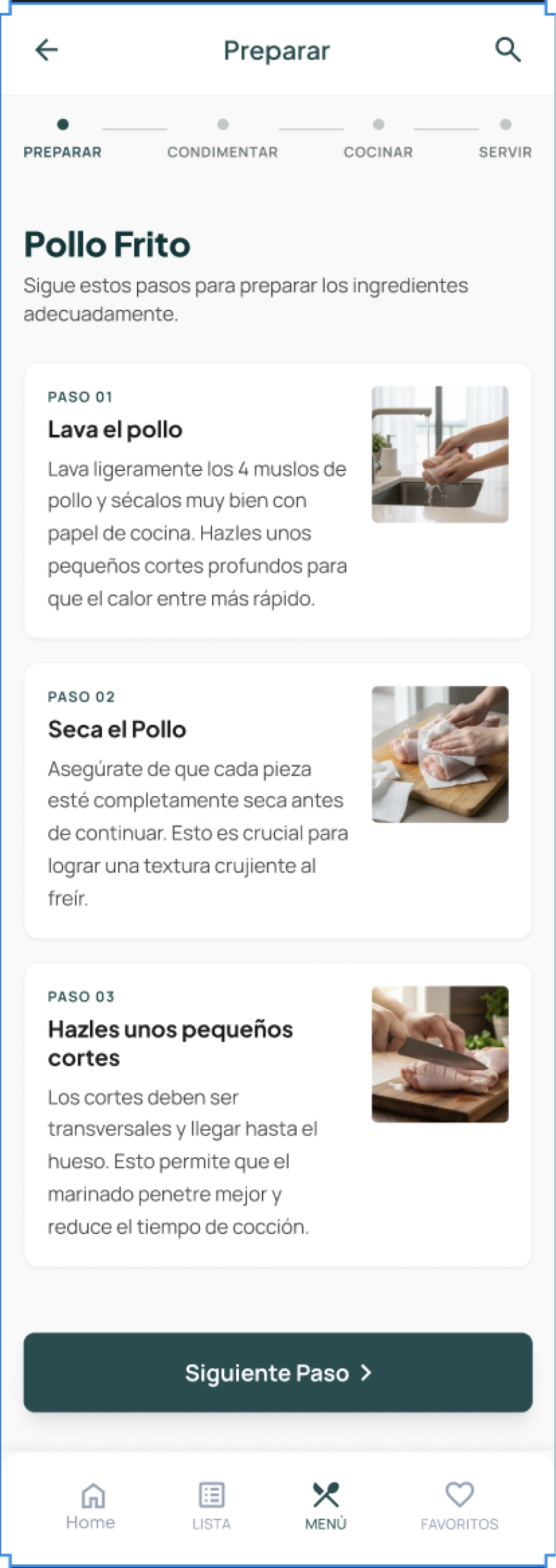
Final design
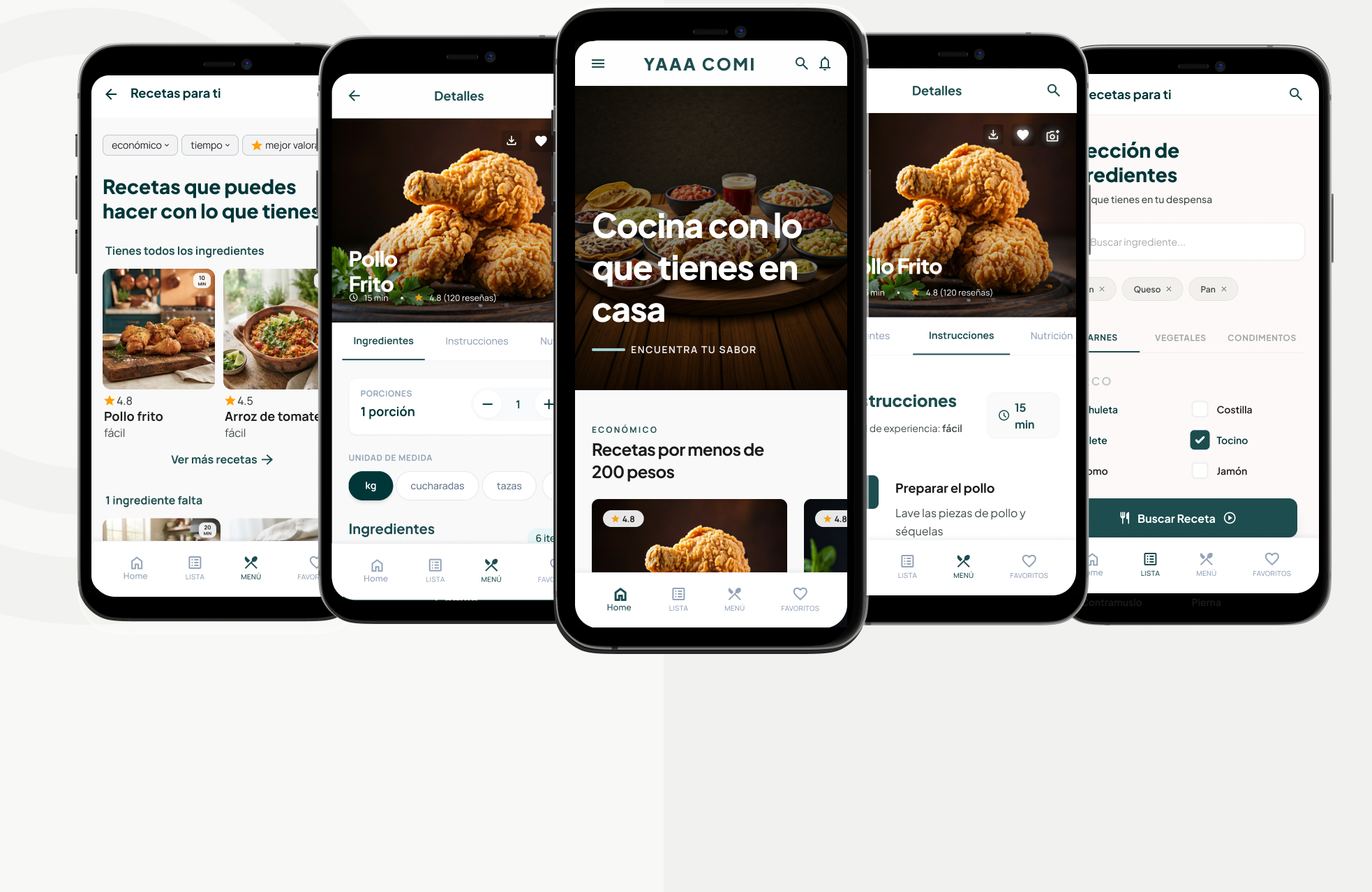
UI decisions
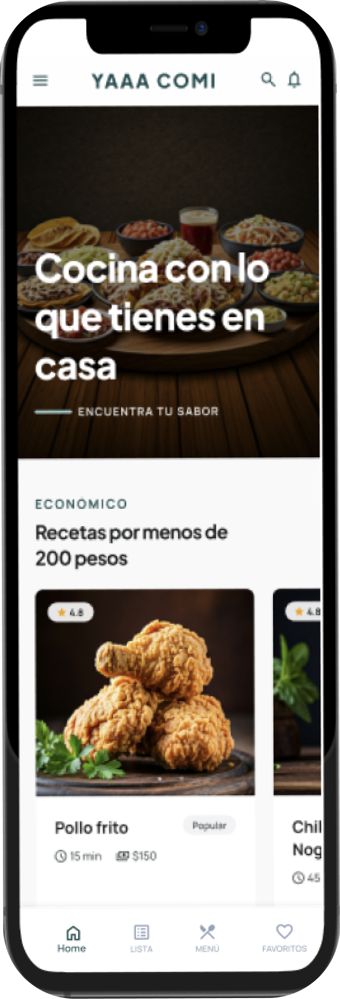
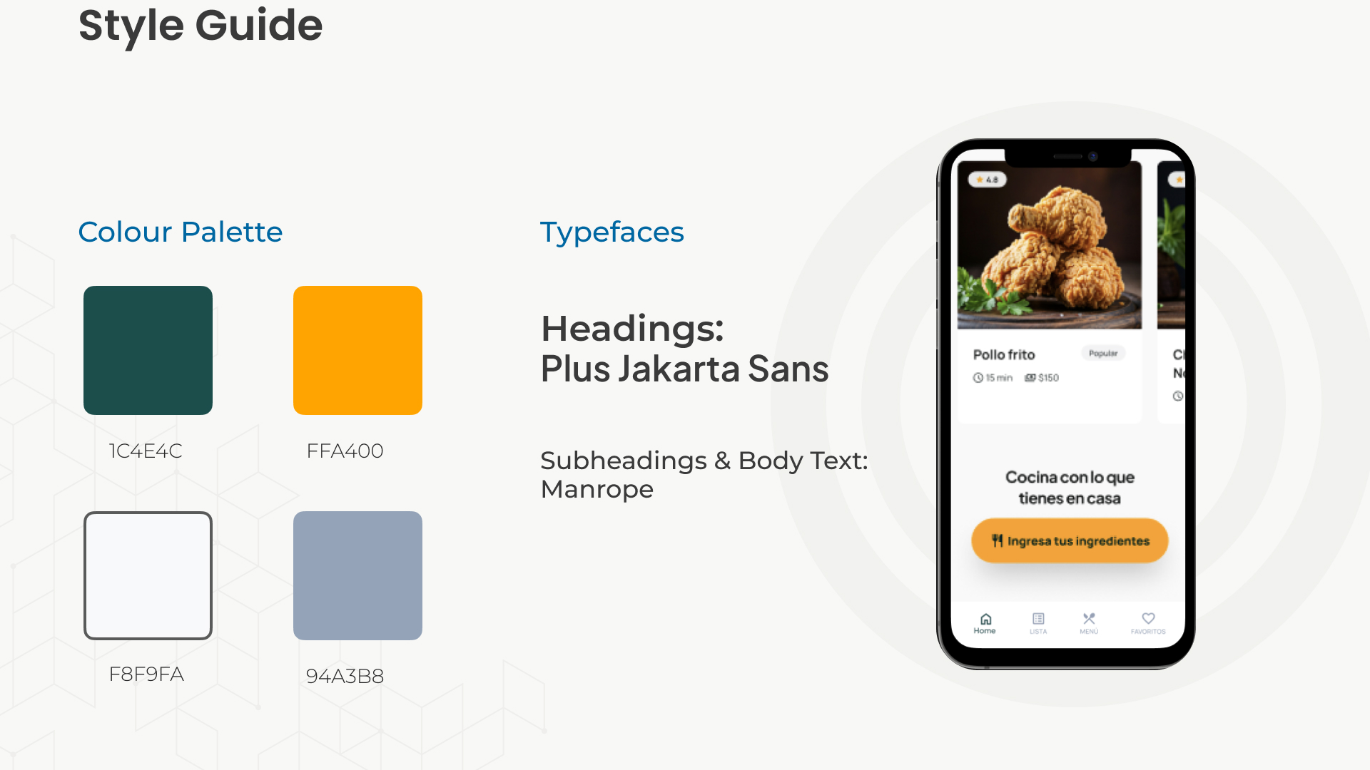
The final design decisions were made with the Senior UX Designer; I designed the screens. Every UI choice traces back to the two core needs: saving time and saving money.
1
Primary color
Dark green for the main actions only, with white text at 9.4 : 1 contrast.
56 px
Primary buttons
Full-width main actions like “Buscar Receta” and “Comenzar”.
2
Typefaces
Plus Jakarta Sans for headings, Manrope for text.
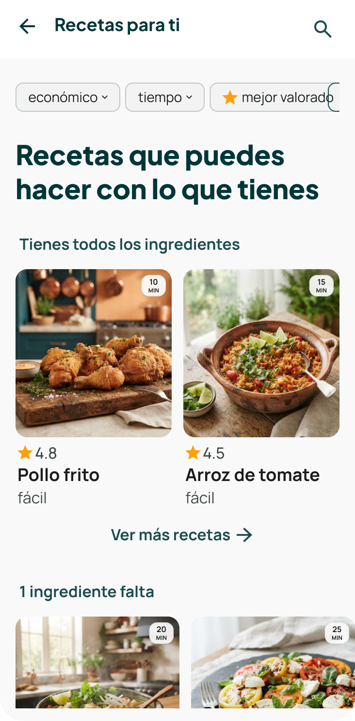
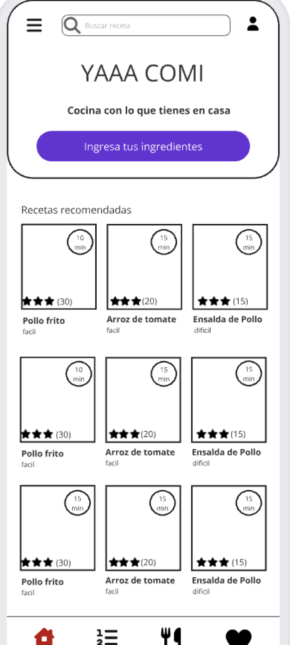
“económico”, “tiempo” and “mejor valorado” come straight from the core needs. Results are split into “you have all ingredients” and “one ingredient missing”.
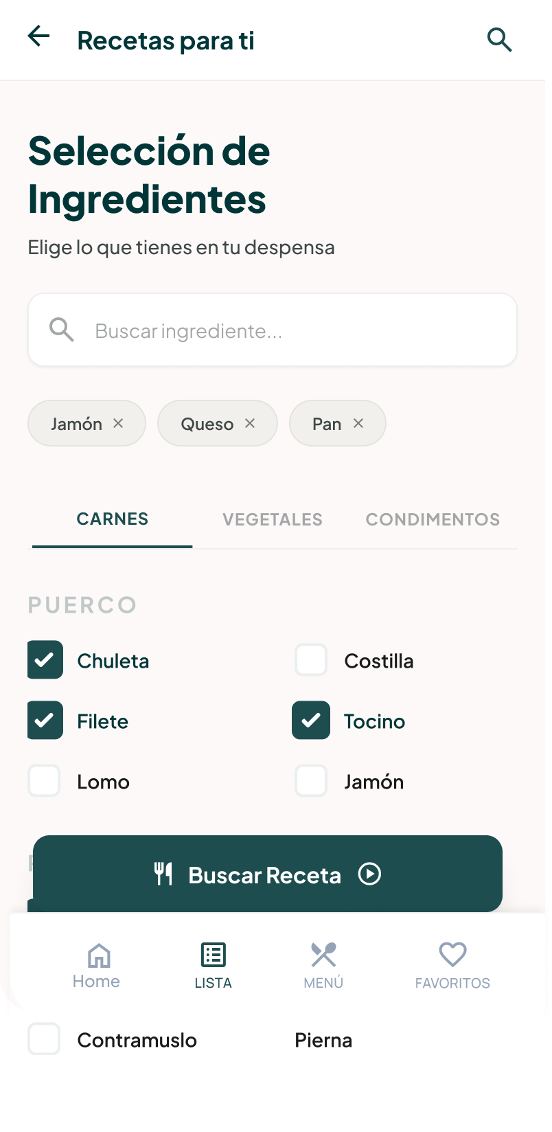
Ingredients as chips that can be removed one by one, and one clear primary action: “Buscar Receta”.
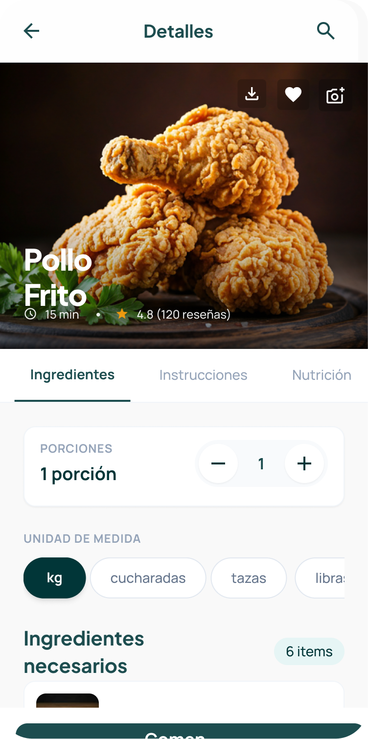
A portion stepper and a unit switcher (kg, spoons, cups, pounds) right inside the recipe.
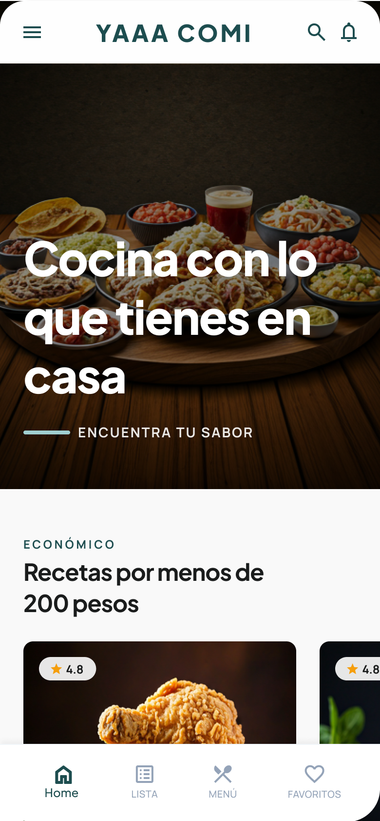
Categories like “recipes under 200 pesos” put the cost up front.
06 · Reflection
No matter how well you plan your interviews, users will surprise you. This taught me to move away from assumptions and stay genuinely curious. It also showed me how much a multi-disciplinary team gains from different perspectives.
Next time I’d ask more follow-up questions, start prototyping earlier and look at existing designs for inspiration already during wireframing.